Hello everybody,
Michael here, and today’s post will be about creating visualizations in Python’s pandas package. This is the dataset we will be using:
These three datasets contains information regarding the Tokyo 2021 (yes I’ll call it that) Olympics medal tally for each participating country-this include gold medal, silver medal, bronze medal, and total medal tallies for each nation.
Once you open your IDE, run this code:
import pandas as pd

tokyo21medals = pd.read_csv('C:/Users/mof39/Downloads/Tokyo Medals 2021.csv')
Now, let’s check the head of the data-frame we’ll be using for this lesson. Here’s the head of the tokyo21medals data-frame:

As you can see, this data-frame has 5 variables, which include:
Country-the name of a countryGold Medal-the country’s gold medal tallySilver Medal-the country’s silver medal tallyBronze Medal-the country’s bronze medal tallyTotal-the country’s total medal tally
OK, now that we’ve loaded and analyzed our data-frame, let’s start building some visualizations.
Let’s create the first visualization using the tokyo21medals data-frame with this code:
tokyo21medals.plot(x='Country', y='Total')And here’s what the plot looks like:

The plot was successfully created, however, here are some things we can fix:
- The y-axis isn’t labelled, so we can’t tell what it represents.
- A title for the plot would be nice as well.
- The plot should be larger.
- A line graph isn’t the best visual for what we’re trying to plot
So, how can we make this graph better? The first thing we’d need to do is import the MATPLOTLIB package:
import matplotlib.pyplot as plt
%matplotlib inline
What exactly does the MATPLOTLIB package do? Well, just like the pandas package, the MATPLOTLIB package allows you to create Python visualizations. However, while the pandas package allows you to create basic visualizations, the MATPLOTLIB package allows you to add interactive and animated components to the visual. MATPLOTLIB also allows you to modify certain components of the visual (such as the axis labels) that can’t be modified with pandas alone; in that sense, MATPLOTLIB works as a great supplement to pandas.
- I’ll cover the MATPLOTLIB package more in depth in a future post, so stay tuned!
The %matplotlib inline code is really only used for Jupyter notebooks (like I’m using for this lesson); this code ensures that the visual will be displayed directly below the code as opposed to being displayed on another page/window.
Now, let’s see how we can fix the visual we created earlier:
tokyo21medals.plot(x='Country', y='Total', kind='bar', figsize=(20,11))
plt.title('Tokyo 2021 Medals', size=15)
plt.ylabel('Medal Tally', size=15)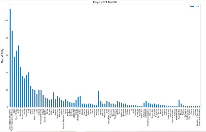
In the plot() function, I added two parameters-kind and figsize. The kind parameter allows you to change the type of visual you want to create-the default visual that pandas uses is a line graph. By setting the value of kind equal to bar, I’m able to create a bar-chart with pandas. The figsize parameter allows you to change the size of the visual using a 2-value tuple (which can consists of integers and/or floats). The first value in the figsize tuple represents width (in inches) of the visual and the second value represents height (also in inches) of the visual. In this case, I assigned the tuple (20,11) to the `figsize parameter, which makes the visual 20 inches wide by 11 inches tall.
Next, take a look at the other lines of code in the code block (both of which begin with plt). The plt functions are MATPLOTLIB functions that allow you to easily modify certain components of your pandas visual (in this case, the y-axis and title of the visual).
In this example, the plt.title() function took in two parameters-the title of the chart and the font size I used for the title (size 15). The plt.ylabel() function also took in two parameters-the name and font size I used for the y-axis label (I also used a size 15 font here).
So, the chart looks much better now, right? Well, let’s take a look at the x-axis:

The label for the x-axis is OK, however, it’s awfully small. Let’s make the x-axis label size 15 so as to match the sizing of the title and y-axis label:
plt.xlabel('Country', size=15)To change the size of the x-axis label, use the plt.xlabel() function and pass in two parameters-the name and size you want to use for the x-axis label. And yes, even though there is already an x-axis label, you’ll still need to specify a name for the x-axis label in the plt.xlabel() function.
- Just a helpful tip-execute the
plt.xlabel()function in the same code-block where you executed theplot()function andplt()functions.
Now, let’s see what the x-axis label looks like after executing the code I just demonstrated:

The x-axis label looks much better (and certainly more readable)!
Thanks for reading,
Michael