Hello everybody,
It’s Michael, and I will be doing an R analysis on this post. More specifically, I will be doing a comparative clustering analysis, which means I’ll take a dataset and perform both k-means and hierarchical clustering analysis with that dataset to analyze the results of each method. However, this analysis will be unique, since I will be revisiting of the earliest datasets I used for this blog-TV shows-which first appeared in R Lesson 4: Logistic Regression Models on July 11, 2018 (exactly nine months ago!) In case you forgot what this dataset was about, it basically gives 85 shows that aired during the 2017-18 TV season and whether or not they were renewed for the 2018-19 TV season along with other aspects of those shows (such as the year they premiered and the network they air on). I’ll admit I chose this dataset because I wanted to analyze one of my old datasets in a different way (remember I performed linear and logistic regression the first time I used this dataset).
So, as always, let’s load the file and get a basic understanding of our data:

As you can see, we have 85 observations of 10 variables. Here’s a detailed breakdown of each variable:
TV.Show-The name of the showGenre-The genre of the showPremiere.Year-The year the show premiered; for revivals like Roseanne, I used the original premiere year (1988) as opposed to the revival premiere year (2018)X..of.seasons..17.18.-How many seasons the show had aired as of the end of the 2017-18 TV seasonNetwork-The network (or streaming service) the show airs onX2018.19.renewal.-Whether or not the show was renewed for the 2018-19 TV season; 1 denotes renewal and 0 denotes cancellationRating-The content rating for the show. Here’s a more detailed breakdown:- 1 means TV-G
- 2 means TV-PG
- 3 means TV-14
- 4 means TV-MA
- 5 means not applicable
Usual.Day.of.Week-The usual day of the week the show airs its new episodes. Here’s a more detailed breakdown:- 1 means the show airs on Mondays
- 2 means the show airs on Tuesdays
- 3 means the show airs on Wednesdays
- 4 means the show airs on Thursdays
- 5 means the show airs on Fridays
- 6 means the show airs on Saturdays
- 7 means the show airs on Sundays
- 8 means the show doesn’t have a regular air-day (usually applies to talk shows or shows on streaming services)
Medium-the type of network the show airs on. Here’s a more detailed breakdown:- 1 means the show airs on either one of the big 4 broadcast networks (ABC, NBC, FOX or CBS) or the CW (which isn’t part of the big 4)
- 2 means the show airs on a cable channel (AMC, Bravo, etc.)
- 3 means the show airs on a streaming service (Hulu, Amazon Prime, etc.)
Episode Count-the new variable I added for this analysis; this variable shows how many episodes a show has had overall since the end of the 2017-18 TV season. For certain shows whose seasons cross the 17-18 and 18-19 seasons, I will count how many episodes each show has had as of September 24, 2018 (the beginning of the 2018-19 TV season)
Now that we’ve learned more about our variables, let’s start our analysis. But first, I convert the final four variables into factors, since I think it’ll be more appropriate for the analysis:

Ok, now onto the analysis. I’ll start with k-means:

Here, I created a data subset using our third and tenth columns (Premiere.Year and Episode.Count respectively) and displayed the head (the first six observations) of my cluster.
Now let’s do some k-means clustering:

I created the variable tvCluster to store my k-means model using the name of my data subset-cluster1-the number of clusters I wanted to include (4) and nstart, which tells the models to start with 35 random points then select the one with the lowest variation.
I then type in tvCluster to get a better idea of what my cluster looks like. The first thing I see is “K-means clustering with (X) clusters of sizes”, before mentioning the amount of observations in each cluster (which are 17, 64, 1 and 3, respectively). In total, all 85 observations were used since I didn’t have any missing data points.
The next thing that is mentioned is cluster means, which gives the mean for each variable used in the clustering analysis (in this case, Episode.Count and Premiere.Year). Interestingly enough, Cluster 2 has the highest mean Premiere.Year (2015) but the lowest mean Episode.Count (49. rounded to the nearest whole number).
After that, you can see the clustering vector, which shows you which observations belong to which cluster. Even though the position of the observation (e.g. 1st, 23rd) isn’t explicitly mentioned, you can tell which observation you are looking at since the vector starts with the first observation and works its way down to the eighty-fifth observation (and since there is no missing data, all 85 observations are used in this clustering model). For instance, the first three observations all correspond to cluster 1 (the first three shows listed in this dataset are NCIS, Big Bang Theory, and The Simpsons). Likewise, the final three observations all correspond to cluster 2 (the corresponding shows are The Americans, Baskets, and Comic Book Men).
Next you will see the within cluster sum of squares for each cluster, which I will abbreviate as WCSSBC; this is a measurement of the variability of the observations in each cluster. Remember that the smaller this amount is, the more compact the cluster. In this case, 3 of the 4 WCSSBC are above 100,000, while the other WCSSBC is 0 (which I’m guessing is cluster 3, which has only one observation).
Last but not least is between_SS/total_SS=94.5%, which represents the between sum-of-squares and total sum-of-squares ratio, which as you may recall from the k-means lesson is a measure of the goodness-of-fit of the model. 94.5% indicates that there is an excellent goodness-of-fit for this model.
Last but not least, let’s graph our model:
![]()

In this graph, the debut year is on the x-axis, while the episode count is on the y-axis. As you can see, the 2 largest clusters (represented by the black and red dots) are fairly close together while the 2 smallest clusters (represented by the blue and green dots) are fairly spread out (granted, the two smallest clusters only have 1 and 3 observations, respectively). An observation about this graph that I wanted to point out is that the further back a show premiered doesn’t always mean the show has more episodes than another show that premiered fairly recently (let’s say anytime from 2015 onward). This happens for several reasons, including:
- Revived series like American Idol (which took a hiatus in 2017 before its 2018 revival) and Roseanne (which had been dormant for 21 years before its 2018 revival)
- Different shows air a different number of episodes per season; for instance, talk shows like Jimmy Kimmel live have at least 100 episodes per season while shows on the Big 4 networks tend to have between 20-24 episodes per season (think Simpsons, The Big Bang Theory, and Grey’s Anatomy). Cable and streaming shows usually have even less episodes per season (between 6-13, like how South Park only does 10 episode seasons)
- Some shows just take long breaks (like how Jessica Jones on Netflix didn’t release any new episodes between November 2015 and March 2018)
Now time to do some hierarchical clustering on our data. And yes, I plan to use all the methods covered in the post R Lesson 12: Hierarchical Clustering.
Let’s begin by scaling all numerical variables in our data (don’t include the ones that were converted into factor types):
![]()
Now let’s start off with some agglomerative clustering (with both the dendrogram and code):


After setting up the model using Euclidean distance and complete linkage, I then plot my dendrogram, which you can see above. This dendrogram is a lot neater than the ones I created in R Lesson 12, but then again, this dataset only has 85 observations, while the one in that post had nearly 7,200. The names of the shows themselves aren’t mentioned, but each of the numbers displayed correspond to a certain show. For instance, 74 corresponds to The Voice, since it is the 74th show listed in our dataset. Look at the spreadsheet to figure out which number corresponds to which show.
You may recall that I mentioned two general rules for interpreting dendrograms. They are:
- The higher the height of the fusion, the more dissimilar two items are
- The wider the branch between two observations, the more dissimilar they are
Those rules certainly apply here, granted, the highest height is 8 in this case, as opposed to 70. For instance, since the brand between shows 7 and 63 is fairly narrow, these two shows have a lot in common according to the model (even though the two shows in question are Bob’s Burgers and The Walking Dead-the former being a cartoon sitcom and the latter revolving around the zombie apocalypse). On the other hand, the gap between shows 74 and 49 is wider, which means they don’t share much in common (even though the two shows are The Voice and Shark Tank, which both qualify as reality shows, though the former is more competition-oriented than the latter). All in all, I think it’s interesting to see how these clusters were created, since the shows that were grouped closer together seem to have nothing in common.
Now let’s try AGNES (remember that stands for agglomerative clustering):

First of all, remember to install the package cluster. Also, remember that the one important result is the ac, or agglomerative coefficient, which measures the strength of clustering structure. As you can see, our ac is 96.1%, which indicates very strong clustering structure (I personally think any ac at east 90% is good).
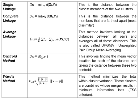
Now let’s compare this ac (which used complete linkage) to the ac we get with other linkage methods (not including centroid). Remember to install the purrr package:

Of the four linkage method’s, Ward’s method gives us the highest agglomerative coefficient (98.2%), so that’s what we’ll use for the next part of this analysis.
Using ward’s method and AGNES, here’s a dendrogram of our data (and the corresponding code):
![]()

Aside from having a greater maximum height than our previous dendrogram (the latter had a maximum height of 8 while this diagram has a maximum height of presumably 18), the observations are also placed differently. For instance, unlike in the previous dendrogram, observations 30 and 71 are side by side. But just as with the last dendrogram, shows that have almost nothing in common are oddly grouped together; for instance, the 30th and 71st observations correspond to The Gifted and Transparent; the former is a sci-fi show based off the X-Men universe while the latter is a transgender-oriented drama. The 4th and 17th observations are another good example of this, as the corresponding shows are The Simpsons and Taken; the former is a long-running cartoon sitcom while the latter is based off of an action movie trilogy.
The last method I will use for this analysis is DIANA (stands for divisive analysis). Recall that the main difference between DIANA and AGNES is that DIANA works in a top-down manner (objects start in a single supercluster and are divided into smaller clusters until single-element clusters are created) while AGNES works in a bottom-up (objects start in single-element clusters and are morphed into progressively larger clusters until a single supercluster is created). Here’s the code and dendrogram for our DIANA analysis:


Remember that the divisive coefficient is pretty much identical to the agglomerative coefficient, since both measure strength of clustering structure and the closer each amount is to 1, the stronger the clustering structure. Also, in both cases, a coefficient of .9 (or 90%) or higher indicates excellent clustering structure. In this case, the dc (divisive coefficient) is 95.9%, which indicates excellent clustering structure.
Just as with the previous two dendrograms, most of the observation pairs still have nothing in common. For instance, the 41st and 44th observations have nothing in common, since the corresponding shows are House of Cards (a political drama) and Brooklyn 99 (a sitcom), respectively. An exception to this would be the 9th and 31st observations, since both of the corresponding shows-Designated Survivor and Bull respectively-are dramas and both are on the big 4 broadcast networks (though the former airs on ABC while the latter airs on FOX).
Now, let’s assign clusters to the data points. I’ll go with 4 clusters, since that’s how many I used for my k-means analysis (plus I think it’s an ideal amount). I’m going to use the DIANA example I just mentioned:
![]()
Now let’s visualize our clusters in a scatterplot (remember to install the factoextra package):
![]()

As you can see, cluster 3 has the most observations while cluster 4 has the least (only one observation corresponding to Jimmy Kimmel Live). Some of the observations in each cluster have something in common, like the 1st and 2nd observations (NCIS and The Big Bang Theory in cluster 1, both of which air on CBS) and the 42nd and 80th observations in cluster 3 (Watch What Happens Live! and The Chew-both talk shows).
Now, let’s visualize these clusters on a dendrogram (using the same DIANA example):
![]()

The first line of code is exactly the same line I used when I first plotted my DIANA dendrogram. The rect.hclust line draws the borders to denote each cluster; remember to set k to the amount of clusters you created for your scatterplot (in this case, 4). Granted, the coloring scheme is different from the scatterplot, but you can tell which cluster is which judging by the size of the rectangle (for instance, the rectangle for cluster 4 only contains the 79th observation, even though it is light blue on our dendrogram and purple on our scatterplot). Plus, all the observations are in the same cluster in both the scatterplot and dendrogram.
Thanks for reading.
Michael