R Lesson 5: Graphing Logistic Regression Models

Hello everybody,

It’s Michael, and today I’ll be discussing graphing with logistic regression. This will serve as a continuation of R Lesson 4: Logistic Regression Models (I’ll be using the dataset and the models from that post).

Let’s start by graphing the second model from R Lesson 4. That’s the one that includes season count and premiere year (I feel this would be more appropriate to graph as it is the more quantitative of the two models).

Here’s the formula for the model if you’re interested (as well as the output):

20Jul capture1

Now let’s plot the model (but first, let’s remember to install the ggplot2 package).

20Jul capture5

Next we have to figure out the probabilities that each show will be renewed (or not).

20Jul capture6

And finally, let’s plot the model.

20Jul capture7

20Jul capture4

What are some conclusions we can draw from the model?

  • The shows with less than 25 seasons and that premiered between 1975 and the early 90s (such as Roseanne which had 10 seasons and premiered in 1988) had no chance at renewal.
  • For shows with less than 25 seasons, the more recently the show premiered, the more likely it was renewed (as shown by the progressively brighter colors).
  • For the few outlier shows with more than 25 seasons (regardless of when they premiered) they had a 100% chance at renewal.
    • The two notable examples would be The Simpsons (at 29 seasons) and SNL (at 43 seasons)

Thanks for reading,

Michael


R Lesson 4: Logistic Regression Models

Hello everybody,

It’s Michael, and today’s post will be the first to cover data modeling in R. The model I will be discussing is the logistic regression model. For those that don’t know, logistic regression models explore the relationship between a binary* dependent variable and one or more independent variables.

*refers to variable with only 2 possible values, like yes/no, wrong/right, healthy/sick etc.

The data set I will be using is-TV shows-which gives a list of 85 random TV shows of various genres that were currently airing during the 2017-18 TV season and whether or not each show was renewed for the 2018-19 TV season. So, like any good data scientist, let’s first load the file and read (as well as understand) the data.

9Jul capture1

The variables include

  • TV Show-the name of the TV show
  • Genre-the genre of the TV show
  • Premiere Year-the year the TV show premiered (for reboots like Roseanne, I included the premiere date of the original, not the revival)
  • X..of.seasons..17.18. (I’ll refer to it as season count)-how many seasons the show had aired at the conclusion of the 2017-18 TV season (in the case of revived shows like American Idol, I counted both the original run and revival, which added up to 16 seasons)
  • Network-the network the show was airing on at the end of the 2017-18 TV season
  • X2018.19.renewal. (my binary variable)-Whether or not the show was renewed for the 2018-19 TV season
    • You’ll notice I used 0 and 1 for this variable; this is because it is a good idea to use dummy variables (the 0 and 1) for your binary dependent variable to help quantify qualitative data.
      • The qualitative data in this case being whether a show was renewed for the 2018-19 TV season (shown by 1) or not (shown by 0)


Now that we know the variables in our data set, let’s figure out what we want to analyze.

  • Let’s analyze the factors (eg. network, genre) that affected a certain TV show’s renewal or cancellation (the binary variable represented by 0/1)

So here’s the code to build the model, using the binary dependent variable and two of the independent variables (I’ll use genre and premiere year)

9Jul capture2

9Jul capture3

9Jul capture4

What does all of this output mean?

  • The call just reprints the model we created.
  • The estimate represents the change in log odds (or logarithm of the odds) for the dependent variable should a certain independent variable variable be increased by 1.
    • Log odds function–>log(p/(1-p))
    • For instance, if the premiere year increases by 1 (let’s say from 2009 to 2010), the odds that it was renewed for the 18-19 TV season decrease by 6.73% (as evidenced by the -0.06763 as the premiere year estimate)
  • Standard error represents how far the sample mean is from the population mean. In the case of premiere year, the two means are close together. In the case of genre however, the two means are mostly far apart (then again, genre isn’t numerical).
  • Z-value is the ratio of the estimate to the standard error
  • P-value (denoted by Pr(|>z|)) helps you determine the significance of your results by giving you a number between 0 and 1
    • P-values are used to either prove or disprove your null hypothesis (a claim you are making about your data)
      • Let’s say you think a show’s genre and premiere year affected its chances of renewal; this would be your null hypothesis.
      • Your alternative hypothesis would be the opposite of your null hypothesis; that is, genre and premiere year don’t affect a shows chances of renewal
    • Small p-values (those <=0.05) indicate strong evidence against the null hypothesis, so in these cases, you can reject the null hypothesis. For p-values larger than 0.05, you should accept the null hypothesis.
      • Since all the p-values are well above 0.05, you can accept the null hypothesis
  • Null deviance shows how well our dependent variable (whether or not a show got renewed) is predicted by a model that includes only the intercept
  • Residual deviance shows how well our dependent variable (whether or not a show got renewed) is predicted by a model that includes the intercept as well as any independent variables
    • As you can see here, the residual deviance is 89.496 on 71 degrees of freedom, a decrease of 20.876 from null deviance (as well as a decrease of 13 degrees of freedom).
  • AIC (or Akaike Information Criterion) is a way to gauge the quality of your model through comparison of related models; the point of the AIC is to prevent you from using irrelevant independent variables.
    • The AIC itself is meaningless unless we have another model to compare it to, which I will include in this post.
  • The number of Fisher scoring iterations shows how many times the model ran to attain maximum likelihood, 17 in this case. This number isn’t too significant.

Now let’s create another model, this time including season count in place of genre.

10Jul capture1

How does this compare to the previous model?

  • There is a smaller difference between null & residual deviance (12.753 and 2 degrees of freedom, as opposed to 20.876 and 13 degrees of freedom)
  • The AIC is 13.88 smaller than that of the previous model, which indicates a better quality of the model
  • The number of Fisher scoring iterations is also lower than the previous model (5 as opposed to 17), which means it took less tries to attain maximum likelihood (that a show was renewed)
  • The estimate for premiere year also increased
    • This time, if premiere year increases by 1, the odds that a show was renewed for the 2018-19 TV season increased by 14.81%, rather than decreased.
    • If season count increased by 1 (say from 4 to 5 seasons), then the odds a show was renewed increased by 31.45%
  • The asterisk by season count just gives an idea of the range of p-values of season count (denoted by Pr(|>z|))
    • The p-value of season count is >0.01 but <0.05 (which makes perfect sense as Pr(|>z|) is 0.027
  • Let’s create two null hypotheses-premiere year and season count affects a show’s chances of renewal (we are treating these as separate hypotheses).
    • Premiere year is greater than 0.05, so accept this null hypothesis.
      • In other words, premiere year did affect a show’s chances for renewal.
    • Season count is less than 0.05, so reject this null hypothesis.
      • In other words, season count didn’t affect a show’s chances for renewal.

That’s all for now. Thanks for reading.

Michael


R Lesson 3: Basic graphing with R

Hello everybody,

This is Michael, and today’s post will be on basic graphing with R. I’ll be using a different dataset for this post-murder_2015_final , which details the change in homicide rates from 2014 to 2015 as well as the individual homicide rates for 2014 and 2015 in 83 US cities (I felt this one was more quantitive than the dataset I used in my last two posts).

So let’s begin with a bar chart.

29Jun capture2

  • If you can’t read this, here’s the code
    • plot(file$X2015_murders, file$change, pch=20, col=”red”, main=”2014-2015 murder rate changes”, xlab=”2015 murders”, ylab=”Change from 2014 homicide rate”)

29Jun capture1

As you can see, there are two outliers at the upper-right hand corner of the screen. If you want to find out what those cities might be, here’s how you would add labels to each of the points.

1jul-capture2.png

  • Remember not to close the window with the graph when typing this command!

1Jul capture

From this graph, we can see that the two outliers (or cities with the largest 2014-to-2015 rise in murder rates) are Chicago and Baltimore.

Let’s try a bar graph now. Here’s the command to make a basic bar chart.

1Jul capture4

1Jul capture3

As you can see, 53 of the cities had a year-to-year rise in murder rates, 4 had no change in murder rates, and 26 had a year-to-year drop in murder rates (if you’re wondering what those cities are, check the spreadsheet attached to this post).

Let’s make another graph-the box plot. Here is the command

1Jul capture6

1Jul capture5

Some things to know when reading a box plot

  • The bold dashes represent the median value for the murders in a certain state (or only value if a state appears just once)
  • The top and bottom lines represent the lowest and highest values corresponding to a certain state
  • The yellow bars denote the range of the majority of values for a certain state
  • The dashed lines on the top and bottom of the chart show the highest and lowest values not in the range denoted by the yellow bar
    • If there aren’t any dashed lines, then the yellow bars denote all of the values, not just the majority
  • Any circles you see are outliers corresponding to a particular state.


One more thing, if you’re wondering where I got this data from, here the website-https://github.com/fivethirtyeight/data/blob/master/murder_2016/murder_2015_final.csv. The website is FiveThirtyEight.com, which writes interesting data-driven articles, such as  The Lebron James Decision-Making Machine. FiveThirtyEight then posts the code and data used in these articles on GitHub so anyone can perform statistical analyses on the data (good place to look for free datasets for your own data analysis project, and much more interesting than the free datasets that come with R with data 40+ years old).

Thank you,

Michael

R Lesson 2: Basic summarization of R Data

Hello everybody,

This is Michael, and today’s post will be about basic summarization of R Data. I thought this would be an appropriate place to continue from R Lesson 1: Basic R commands (I’ll be using the dataset from that post).

Let’s start off simple by using the summary() command to display a summary of the age field.

27Jun capture1

As you can see, the output shows the minimum age for any congressperson (25), the end of the 1st quartile (45.4), the median age (53), the mean age (53.31), the beginning of the third quartile (60.55), and the maximum age (98.1). But what does this all mean?

  • The minimum is obviously the minimum age amongst the congresspeople-25 years
  • The 1st quartile is the age between the minimum and the mean (45.4)
    • In other words, the youngest 25% of congresspeople were between 25 and 45.4 years old (at the start of their terms)
  • The median is the center of all the ages amongst the congresspeople-53 years in this case
    • 50% of congresspeople were between 45.4 and 60.55 years old (at the start of their terms)
  • The mean is the average of all the ages
  • The 3rd quartile is the age between the median and the maximum (60.55)
    • In other words, the oldest 25% of congresspeople were between 60.55 and 98.1 years old (at the start of their terms)
  • The maximum is obviously the maximum age amongst the congresspeople-98.1 years

However, if you use summary on a non-numeric field, such as state, the counts for each observation (in this case, how many times each state appears in the dataset).

27Jun capture2

Another summary command I will discuss is table(), which shows all values of a variable along with each values’ frequencies (how many times that value appears in the dataset).

Below is a table displaying the number of congresspeople who are representatives, as well as those who are senators.

27Jun capture3

Now here’s what the table would look like if we add another value (I’ll use congress)

27Jun capture4

Like the last table, this table shows the number of representatives and senators, except divided up by congress (80th to 113th specifically).

Thanks for reading,

Michael


R Lesson 1: Basic R commands

Hello everyone,

It’s Michael, and I thought a perfect first post (aside from my welcome post) would be an intro to the wonderful, statistical and completely free software known as R. The dataset I will use will be congress-terms.csv, which I have attached to this post.

To start we will first upload the file onto R. If you are wondering how to do that, here’s the command:

  • dataFile <- read.csv(“/Users/michaelorozco-fletcher/Downloads/congress-terms.csv”)

You may choose different a different variable name. Your file path will be different too. To know what your file path is, open up Excel, then click File > Properties. This window will pop up.

screengrab2

The location field would be your file path (along with a slash and the file name, congress-terms.csv in this case, after “Downloads”).

Allright, now that I explained how to read a CSV file onto R, here are some basic R commands.

screengrab1

str(dataFile) displays a summary of all the data fields in the file, which is important for understanding the data you are working with. As mentioned above, there are 18635 observations of 13 variables, which include

  • congress-which term of Congress does a particular congressperson serve in (anywhere from the 80th-lasting from 1947 to 1949-to the 113th-lasting from 2013 to 2015)
  • chamber-whether a particular congressperson is a part of the House or Senate
  • bioguide-each congressperson’s ID Number within the Biographical Directory of the United States Congress
  • firstname, middlename, lastname-These are self-explanatory
  • suffix-A “Jr.” or “III” or something like that at the end of a particular congressperson’s name
  • birthday-Again, self-explanatory
  • state-What state the congressperson serves
  • party-A congressperson’s party affiliation, whether D for Democrat, R for Republican, I for independent, among others
  • incumbent-whether a congressperson was in office at the beginning of a particular term (such as the 110th Congress) or came into office after another congressperson left
  • termstart-when a term of Congress began
  • age-how old a congressperson was when a term began


Now lets check out some other basic commands. I used the age field because it is the field with the most numbers.

screengrab3

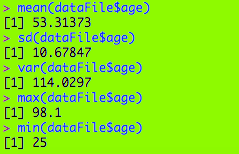
Above you will find the mean, sd (standard deviation-square root of variance), var (variance-the standard deviation squared), max, and min for the age field. Some inferences we can make include

  • There is a fair spread among the ages (10.67 years, as given by sd)
  • The ages are quite spread out from the 53.31 mean (as given by the 114.03 var)
  • The oldest congressperson was almost 100 when his term began (J. Strom Thurmond, 1902-2003)

These are just a few of the basic commands. For more commands check out https://www.calvin.edu/~scofield/courses/m143/materials/RcmdsFromClass.pdf

Here’s the spreadsheet: congress-terms

Thank you,

Michael