R Lesson 25: Creating & Reading Word Documents in R

Advertisements

Hello everybody,

Michael here, and today’s post will be on creating and reading Microsoft Word documents in R.

As you’ve seen in my previous blog posts, R is capable of several amazing things-you can create a game of Minesweeper, plot US maps and color-code them with data, create calendar plots (with moon phases included), and so much more.

First, let’s discuss how to create Word documents in R. We’ll need to start by installing two packages-officer and dplyr.

Once these two packages are installed, let’s use the read_docx() function to create an empty Word document:

testDoc <- read_docx()
  • Ideally, you should store the empty document in a variable.

Now, after creating the empty document, let’s add some text to the document:

testDoc <- testDoc %>% body_add_par("This is the first line on the document") 
testDoc <- testDoc %>% body_add_par("Here is another test paragraph") 
testDoc <- testDoc %>% body_add_par("And here is yet another test paragraph") 

Using the body_add_par() function, three paragraphs will be added to the word document. Keep in mind that three separate paragraphs will be added, therefore, the three lines of text you see here will appear on three different lines. If you wanted to add all these lines on the same paragraph, you’d only need to use one body_add_par() line.

Now, what if you wanted to add some images to the document? Here’s how you’d do that:

set.seed(0)
img <- tempfile(fileext=".png")
png(filename=img, width=6, height=6, units='in', res=500)
plot(sample(100,50))
dev.off()
null device 
          1 
testDoc <- testDoc %>% body_add_img(src = img, width = 5, height = 5, style = "centered")

To add an image to a Word document via R, you’ll need to create a temp file using the tempfile() function (and remember to store the temp file in a variable). Temp files (or temporary files) are files that need to be stored on your computer momentarily and removed when they are no longer needed. You’d also need to run the plot() function in order to plot the sample image onto the document.

Now, to save the document to your computer, run this code:

print(testDoc, target="C:/Users/mof39/OneDrive/Documents/testDoc.docx")

To save the document, you’d need to run the print() function along with two parameters-the document you created earlier, and a target location on your computer where you want to store the document. If there’s a certain location on your computer where you wish to save the Word document, you’ll need to specify the whole path as the target.

Here’s what the Word document looks like:

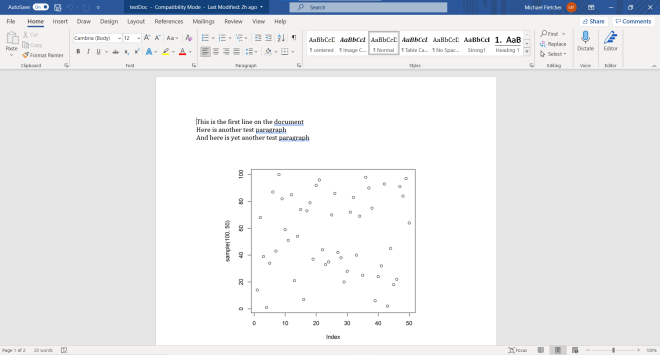
As you can see, the Word document has the three paragraphs (rather, lines) that we added, along with the plot-image that we added.

But what if you wanted to add a non-plot image to the document? Here’s how to do so:

testDoc2 <- read_docx("C:/Users/mof39/OneDrive/Documents/testDoc.docx")
testDoc2 <- testDoc2 %>% body_add_img(src = "C:/Users/mof39/OneDrive/Pictures/ball.png", width=5, height=5, style="centered")
print(testDoc2, target="C:/Users/mof39/OneDrive/Documents/testDoc.docx")

To add a new image to a word document, you’d first create a new document object and run the read_docx() function-passing in the path to the original test document as a parameter for this function. Next, to add a new image to the document, run the body_add_img function and pass in the necessary parameters-the path to the image on your computer, the image’s height, width, and style. Finally, save the image by running the print function, using the new document variable and the path to the original test document as parameters (use the path to the original test document as the target parameter).

  • If you want to add a new paragraph to your document, use the body_add_par() function. Refer to the body_add_par() example earlier in this post if you’re unsure of the syntax you’ll need to use.

Here’s what the document looks like with the added image:

Awesome! Now that we’ve covered the basics of creating Word documents in R, let’s now discuss how to read existing Word documents in R.

To start, let’s demonstrate how to read the Word document we just created into R:

testDoc3 <- read_docx("C:/Users/mof39/OneDrive/Documents/testDoc.docx")
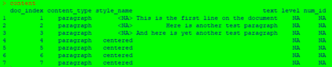
content <- docx_summary(testDoc3)

To read a Word document into R, use the read_docx() function and pass the path (the location where the document is stored on your computer) to the document as the parameter for the function. Remember to store the output for this function in a variable (I used test3 in this example).

Next, to be able to display the document’s content, run the docx_summary() function and pass in the variable your created in the previous step as the function parameter. Just as with the previous step, you should store the output for this step in a variable (I used content in this example).

To actually see the document’s content, run the command content (or whatever variable you used for the docx_summary() function output) in the R console. As you can see from the example above, this function returns a data-frame that contains the Word document’s content. This data-frame gives you information such as the content type of a certain element along with the content of the element (such as the text of the paragraph).

Now, what if we only wanted to retrieve a certain content type when we read in the document? Here’s how to do so:

paragraph <- content %>% filter(content_type == "paragraph")
paragraph$text

To only retrieve a certain element type from the file, run the content %>% filter(content_type == "paragraph") line-remember to store the output from this function in a variable. Also remember to replace content with the variable name you used for the output of the docx_summary() function.

To actually retrieve the text from each paragraph, run the command paragraph$text (remember to replace paragraph with whatever variable name you used for the output of the filter() function.

Thanks for reading,

Michael

R Lesson 24: A GUI for ggplots

Advertisements

Hello everybody,

Michael here, and first of all, thank you all for reading my first 100 posts-your support is very much appreciated! Now, for my 101st post, I will start a new series of R lessons-today’s lesson being on how to use an R GUI (graphical user interface for those unfamiliar with programming jargon) to build data visualizations and to perform some exploratory data analysis.

Now, you may be thinking that you can build data visualizations and perform exploratory data analysis with several lines of code. That’s true, but I will show you another approach to building visuals and performing exploratory data analysis.

At the beginning of this post, I mentioned that I will demonstrate how to use an R GUI. To install the GUI, install the esquisse package in R.

  • Fun fact: the esquisse package was created by two developers at DreamRs-a French R consulting firm (apparently R consulting firms are a thing). Esquisse is also French for “sketch”.

To launch the Esquisse GUI, run this command in R-esquisse:esquisser(). Once you run this command, this webpage should pop up:

Before you start having fun creating visualizations, you would need to import data from somewhere. Esquisse gives you four options for importing your data-a dataframe in R that you created, a file on your computer, copying & pasting your data, or a Googlesheets file (Google Sheets is Google’s version of Excel spreadsheets).

For this demonstration, I will use the 2020 NBA playoffs dataset I used in the post R Analysis 10: Linear Regression, K-Means Clustering, & the 2020 NBA Playoffs.

Now, you could realistically import data into Esquisse through these four commands I just mentioned, but there is a more efficient way to import data into Esquisse. First, I ran this line of code to create a data frame from the dataset I’ll be using-NBA <- read.csv("C:/Users/mof39/OneDrive/Documents/2020 NBA playoffs.csv"). You’d obviously need to change this depending on the dataset you’ll be using and the location on your computer where the dataset is stored.

Next, I ran the command esquisse::esquisser(NBA), which tells Esquisse to automatically load in the NBA data-frame:

As you can see, all the variables from the NBA data-frame appear here. For explanations on each of these variables, please refer to the aforementioned 2020 NBA Playoffs analysis post I hyperlinked to here.

Now, let’s start building some visualizations! Here’s a simple bar-chart using the Pos. and FT. variables:

In this example, I built a simple bar-chart showing the total amount of playoff free throws made (not those that missed) in the 2020 NBA playoffs grouped by player position. Simple enough right? After all, all I did was drag Pos into the X-axis box and FT. into the Y-axis box.

Now, did you know there are further options for modifying the chart? Click on the Bar button and see what you can do:

Depending on the data you’re using for your visualization, you can change the type of visual you use. Any visual icon that looks greyed-out won’t work for the data you’re using; in this example, only a bar-chart, box-plot, or violin-plot would work with the data I’m using.

Here’s what the data looks like as a box-plot:

Now, let’s change this plot back to a bar graph:

Click on the Appearance button:

In the Appearance interface, you can manipulate the color of the bars (either with the color slider or by typing in a color hex code), change the theme of the bar graph (or whatever visual you’re using), and adjust the placement of the legend on your bar graph (if your bar graph has a legend).

  • The four arrows for Legend position allow you to place the legend either to the left of the bar graph, on top of the bar graph, or on the bottom of the bar graph (the X allows you to exclude a legend).
  • The theme allows you to customize the appearance of the bar graph. Here’s what the graph looks like with the linedraw theme:

Now, let’s say we wanted to change the axis labels for our bar-chart and add a title. Click on Labels & Title:

As you can see, we can set a title, subtitle, caption, x-axis label, and y-axis label for our bar chart. In this example, we’ll only set a title, x-axis label, and y-axis label:

Looks good so far-but the print does seem small. Also, the left-aligned title doesn’t look good (but this is just my opinion). Luckily there’s an easy way to fix this. Click on Labels & Title again:

To change the title (or any of the label elements), click on the + sign right by an element’s text box. For all label elements, a mini-interface will appear that allows you to change the font face (though you can’t change the font itself), the font size, and the alignment for all elements. For the title, I’ll use a bold font face with size 16 and center-alignment. For the axis labels, I’ll use a plain font face with size 12 and center-alignment:

Now the graph looks much better!

What if we wanted to filter the graph further? Let’s say we wanted to see this same data, but only for players 30 and over. Click on the Data button:

If you scroll down this interface, you will see all the fields that you can filter the data with; numerical fields are shown with slicers while non-numerical fields are shown as lists of elements. To filter data for only the players who are 30 and over, move the left end of the slider for Age to 30 and keep the right end of the slider in its current position.

  • You can filter by fields that you’re not using in your visual.

Last but not least, let’s check out the Code button:

Unlike the other four buttons, the Code button doesn’t alter anything in the bar chart. Rather, the Code button will simply display the R code used to create the chart. Honestly, I think this is a pretty great feature for anyone who’s just getting started with R and wants to get the basic idea of how to create simple ggplots.

Lastly, let’s explore how to export your visualization. To export your visualization, first click on the download icon on the upper-right hand side of your visualization:

There are five main ways you can export your visualization-into a PDF, PNG, JPEG, PPTX, or SVG file. Just in case any of you weren’t aware, PNGs and JPEGs are images and a PPTX is a PowerPoint file. An SVG is a standard file type used for rendering 2-D images on the internet.

I will save this visualization as a JPEG. Here’s what it looks like in JPEG form:

You’ll see the graph as I left it, but you won’t see the Esquisse interface in the image (which is probably for the best)

All in all, Esquisse is pretty handy if you want to create simple ggplot visualizations without writing code. Sadly, Esquisse doesn’t allow you to create dashboards yet (dashboards are collections of related visualizations on a single page, like the picture below):

  • This picture shows a sample Power BI dashboard; Power BI is a Microsoft-owned dashboard building tool.