Hey everybody,
It’s Michael, and today’s lesson will be on hierarchical clustering in R. The dataset I will be using is AppleStore, which contains statistics, such as cost and user ratings. for roughly 7200 apps that are sold on the iTunes Store as of July 2017.
- I found this dataset on Kaggle, which is an excellent source to find massive datasets on various topics (whether politics, sports, or something else entirely). You can even sign up for Kaggle with your Facebook or Gmail account to access the thousands of free datasets. The best part is that Kaggle’s datasets have recent information, which is much better than R’s sample datasets with information between 40-70 years old. (I wasn’t paid to write this blurb, I just really think Kaggle is an excellent resource to find data for analytical projects).
Now, as I had mentioned, today’s R post will be about hierarchical clustering. In hierarchical clustering, clusters are created in such a way that they have a hierarchy. To get a better idea of the concept of hierarchy, think of the US. The US is divided into 50 states. Each state has several counties, which in turn have several cities. Those cities each have their own neighborhoods (like Hialeah, Westchester, and Miami Springs in Miami, Florida). Those neighborhoods have several streets, which in turn have several houses. Get the idea?
So, as we should always do with our analyses, let’s first load the file into R and understand our data:


In this dataset, there are 7197 observations (referring to apps) of 16 variables (referring to aspects of the apps). Here is what each variable means:
id-the iTunes ID for the apptrack_name-the name of the appsize_bytes-how much space the app takes up (in bytes)currency-what currency the app uses for purchases (the only currency in this dataset is USD, or US dollars)price-how much the app costs to buy on the iTunes store (0 means its either a free or freemium app)rating_count_tot-the user rating count for all versions of the apprating_count_ver-the user rating count for the current version of the app (whatever version was current in July 2017)user_rating-the average user rating for all versions of the appuser_rating_ver-the average user rating for the current version of the app (as of July 2017)ver-the version code for the most recent version fo the appcont_rating-the content rating for the app; given as a number followed by a plus sign (so 7+ would means the app is meant for kids who are at least 7)prime_genre-the category the app falls undersup_devices.num-how many devices the app supportsiPadSc_urls.num-how many screenshots of the app are shown for displaylang.num-how many languages the app supportsvpp_lic-tells us whether the app has VPP Device Based Licensing enabled (this is a special app-licensing service offered by apple)
Now that I’ve covered that, let’s start clustering. But first, let’s make a missmap to see if we’ve got any missing data and if so, how much:
![]()


According to the missingness map, there are no missing spots in our data, which is a good thing.
Now, the last thing we need to do before we start clustering is scale the numeric variables in our data, which is something we should do so that the clustering algorithm doesn’t have to depend on an arbitrary variable unit. Scaling changes the means of numeric variables to 0 and the standard deviations to 1. Here’s how you can scale:
![]()

I created a data frame using all the numeric variables (of which there are 10) and then scaled that data frame. It’s that simple.
- I know I didn’t scale the data when I covered k-means clustering; I didn’t think it was necessary to do so. But I think it’s necessary to do so for hierarchical clustering.
Now let’s start off with some agglomerative clustering:


First, we have to specify what distance method we would like to use for cluster distance measurement (let’s stick with Euclidean, but there are others you can use). Next, we have to create a cluster variable –hc1– using the hclust function and specifying a linkage method (let’s use complete, but there are other options). Finally, we plot the cluster with the parameters specified above and we see a funny looking tree-like graph called a dendrogram. I know it’s a little messy, and you can’t see the app names, but that what happens when your dataset is 7.197 data points long.
How do we interpret our dendrogram? In our diagram, each leaf (the bottommost part of the diagram) corresponds to one observation (or in this case, one app). As we move up the dendrogram, you can see that similar observations (or similar apps) are combined into branches, which are fused at higher and higher heights. The heights in this dendrogram range from 0 to 70. Finally, two general rules to remember when it comes to interpreting dendrograms is that the higher the height of the fusion, the more dissimilar two items are and the wider the branch between two observations, the less similar they are.
You might also be wondering “What are linkage methods?” They are essentially distance metrics that are used to measure distance between two clusters of observations. Here’s a table of the five major linkage methods:
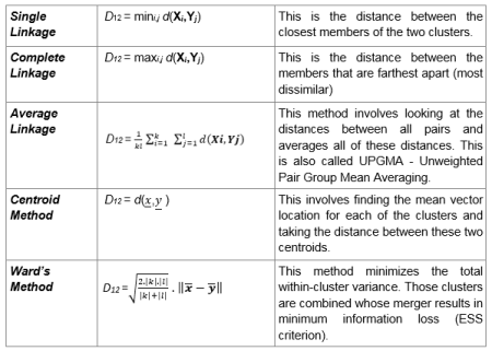

And in case you were wondering what all the variables in the formula mean:
- X1, X2, , Xk = Observations from cluster 1
- Y1, Y2, , Yl = Observations from cluster 2
- d (x, y) = Distance between a subject with observation vector x and a subject with observation vector y
- ||.|| = Euclidean norm
Complete linkage is the most popular method for hierarchical clustering.
Now let’s try another similar method of clustering known as AGNES (an acronym for agglomerative nesting):


This method is pretty similar to the previous method (which is why I didn’t plot a dendrogram for this example) except that this method will also give you the agglomerative coefficient, which is a measurement of clustering structure (I used the line hc2$ac to find this amount). The closer this amount is to 1, the stronger the clustering structure; since the ac here is very, very close to 1, then this model has very, very strong clustering structure.
- Remember to install the package “cluster”!
Now let’s compare the agglomerative coefficient using complete linkage with the agglomerative coefficient using the other linkage methods (not including centroid):


- Before writing any of this code, remember to install the purrr (yes with 3 r’s) package.
We first create a vector containing the method names, then create a comparison of linkage methods by analyzing which one has the highest agglomerative coefficient (in other words, which method gives us the strongest clustering structure). In this case, ward’s method gives us the highest agglomerative coefficient (99.7%).
Next we’ll create a dendrogram using AGNES and ward’s method:
![]()


Next, I’ll demonstrate another method of hierarchical clustering known as DIANA (which is an acronym for divisive analysis). The main difference between this method and AGNES is that DIANA works in a top-down manner (meaning it starts with all objects in a single supercluster and further divides objects into smaller clusters until single-element clusters consisting of each individual observation are created) while AGNES works in a bottom-up manner (meaning it starts with single-element clusters consisting of each observation then groups similar elements into clusters, working its way up until a single supercluster is created). Here’s the code and the dendrogram for our DIANA example:


As you can see, we have a divisive coefficient instead of an agglomerative coefficient, but each serves the same purpose, which is to measure the amount of clustering structure in our data (and in both cases, the closer this number is to 1, the stronger the clustering structure). In this case, the divisive coefficient is .992, which indicates a very strong clustering structure.
Last but not least, let’s assign clusters to the data points. We would use the function cutree, which splits a dendrogram into several groups, or clusters, based on either the desired number of clusters (k) or the height (h). At least one of these criteria must be specified; k will override h if you mention both criteria. Here’s the code (using our DIANA example):
![]()

We could also visualize our clusters in a scatterplot using the factoextra package (remember to install this!):
![]()


In this graph, the observations are split into 5 clusters; there is a legend to the right of the graph that denotes which cluster corresponds to which shape. There are varying amounts of observations in each cluster, for instance, cluster 1 appears to have the majority of the observations while clusters 3 only has 2 observations and cluster 5 only has 1 observation. The observations, or apps, are denoted by numbers* rather than names, so the 2 apps in cluster 3 are the 116th and 1480th observations in the dataset, which correspond to Proloquo2Go and LAMP Words for Life, both of which are assistive communication tools for non-verbal disabled people. Likewise, the only app in cluster 5 is the 499th observation in the dataset, which corresponds to Infinity Blade, which was a fighting/role-playing game (it was removed from the App Store on December 10, 2018 due to difficulties in updating the game for newer hardware).
*the numbers represent the observation’s place in the dataset, so 33 would correspond to the 33rd observation in the dataset
- If you’re wondering what Dim1 and Dim2 have to do with our analysis, they are the two dimensions chosen by R that show the most variation in the data. The amount of variation that each dimensions accounts for in the overall dataset are given in percentages; Dim1 accounts for 21.2% of the variation while Dim2 accounts for 13.7% of the variation in the data.
You can also visualize clusters inside the dendrogram itself by insetting rectangular borders in the dendrogram. Here’s how (using our DIANA example):
![]()


The first line of code is the same pltree line that I used when I first made the DIANA dendrogram. The second line creates the rectangular borders for our dendrogram. Remember to set k to however many clusters you used in your scatterplot (5 in this case). As for the borders, remember to put a colon in between the two integers you will use. As for which two integers you use, remember that the number to the right of the colon should be (n-1) more than the number to the left of the colon-n being the number of clusters you are using. In this case, the number to the left of the colon is 2, while the number to the right of the colon is 6, which is (5-1) more than 2. Two doesn’t have to be the number to the left of the colon, but it’s a good idea to use it anyway.
As you can see, the red square takes up the bulk of the diagram, which is similar to the case with our scatterplot (where the red area consists of the majority of our observations).
Thanks for reading,
Michael


