Python Lesson 30: MATPLOTLIB Histograms, Pie Charts, and Scatter Plots (MATPLOTLIB pt. 3)

Hello everybody,

Michael here, and today’s post will be on creating histograms and pie-charts in MATPLOTLIB (this is the third lesson in my MATPLOTLIB series).

For this lesson, we’ll be using this dataset:

This dataset contains information on the top 125 US grossing movies of 2021 (data from BoxOfficeMojo.com-great source if you want to do data analyses on movies) . Let’s read it into our IDE and learn about each of the variables in this dataset:

import pandas as pd
films2021 = pd.read_excel(r'C:/Users/mof39/OneDrive/Documents/2021 movie data.xlsx')
films2021.head()

Now, what do each of these variables mean? Let’s take a look:

  • Rank-In terms of overall US gross during theatrical run, where the movie ranks (from 1-125)
  • Movie-The name of the movie
  • Total Gross-The movie’s total US gross over the course of its theatrical run (as of January 25, 2022)
  • Screens played in (overall)-The number of US theaters the movie played in during its theatrical run
  • Opening Weekend Gross-The movie’s total opening weekend US gross
  • Opening Weekend % of Total Gross-The movie’s US opening weekend gross’s percentage of the total US gross
  • Opening Weekend Theaters-The number of US theaters the movie played in during its opening run
  • Release Date-The movie’s US release date
  • Distributor-The studio that distributed the movie
  • Rotten Tomatoes Score-The movie’s Rotten Tomatoes Score-0 represents a 0% score and 1 represents a 100% score. For movies that had no Rotten Tomatoes score, a 0 was listed.
    • These are the critics scores I used, not the audience rating (which, if you’ve read Rotten Tomatoes reviews, can vary widely from the critic’s scores).

Now, let’s get started with the visualization creations! First off, let’s explore creating histograms in MATPLOTLIB. For our first MATPLOTLIB histogram, let’s use the Rotten Tomatoes Score column to analyze the Rotten Tomatoes score distribution among the 125 movies on this list:

import matplotlib.pyplot as plt
%matplotlib inline

plt.figure(figsize=(10, 8))
plt.hist(films2021['Rotten Tomatoes Score'])
plt.ylabel('Frequency', size = 15)
plt.xlabel('Rotten Tomatoes Score', size=15)
plt.title('Rotten Tomatoes score distribution among 2021 movies', size=15)

First of all, remeber that since we’re using MATPLOTLIB to create these visualizations, you’ll need to include the lines import matplotlib.pyplot as plt and %matplotlib inline in your code (before you create the plot).

Now, to create the histogram, I used five lines of code. The first line of code simply sets the graph size to 10×8-you’d need to execute this line of code (though you can change the dimensions as you wish). The plt.hist() line of code takes in a single paramter-the column you want to use for the histogram. Since histograms are created with just a single column, you’d only need to pass in one column as the parameter for this function-in this case, I used the Rotten Tomatoes Score column. The next three lines of code set name and size of the graph’s y-label, x-label, and title, respectively.

So, what conclusions can we draw from this graph? First of all, since there are 10 bars in the graph, we can conclude that the Rotten Tomatoes score frequencies are being distributed in 10% intervals (e.g. 0-10%, 10-20%, 20-30%, and so on). We can also conclude that most of the 125 movies in this dataset fall in either the 80-90% interval or the 90-100% interval, so critics seemed to enjoy most of the movies on this list (e.g. Spider-Man: No Way Home, Dune, Free Guy). On the other hand, there are very few movies on this list that critics didn’t enjoy-most of the 0s on this list have no Rotten Tomatoes critic score-as only 11 of the movies on this list had either no critic score or had a score in the 0-10% or 10-20% intervals (e.g. The House Next Door: Meet The Blacks 2).

Now, the graph looks great, but what if you wanted fewer frequency intervals? In this case, let’s cut down the amount of intervals from 10 to 5. Here’s the code to do so:

import matplotlib.pyplot as plt
%matplotlib inline

plt.figure(figsize=(10, 8))
plt.hist(films2021['Rotten Tomatoes Score'], bins=5)
plt.ylabel('Frequency', size = 15)
plt.xlabel('Rotten Tomatoes Score', size=15)
plt.title('Rotten Tomatoes score distribution among 2021 movies', size=15)

As you can see, our graph now only has 5 bars rather than 10. How did I manage to make this change? Pay attention to this line of code:

plt.hist(films2021['Rotten Tomatoes Score'], bins=5)

I still passed in the same column into the plt.hist() function. However, I added the optional bins parameter, which allows me to customize the number of intervals in the histogram (I used five intervals in this case). Since there are only five intervals in this graph rather than 10, the intervals entail 20% score ranges (0-20%, 20-40%, 40-60%, 60-80%, 80-100%).

  • You can use as many intervals as you want for your histogram, but my suggestion is that you take a look at the maximum value of any column you want to use for your histogram and pick a bins value that evenly divides by that maximum value (in this case, I used 5 for the bins since 100 evenly divides by 5).
  • Speaking of maximum value, you’ll only want to use quantiative (numerical) values for your histogram, as quantiative values work best when measuring frequency distribution.

Awesome work so far! Next up, let’s explore pie-charts in MATPLOTLIB. To start with pie-charts, let’s create one based off the Distributors column in the data-frame:

import matplotlib.pyplot as plt
%matplotlib inline

distributors = films2021['Distributor'].value_counts()
distributors = distributors[:6]

plt.figure(figsize=(10,8))
plt.title('Major Movie Distributors in 2021', size=15)
distributors.plot(kind='pie')

So, how did I manage to generate this nice looking pie chart? First of all, to create the pie chart, I wanted to get a count of how many times each distributor appears in the list, so I used PANDAS’ handy-dandy .value_counts() function to get the number of times each distributor appears in the list-I stored the results of the .value_counts() function in the distributors variable. As for the distributors[:6] line of code, I included this since there were over 20 distributors on this list, I only wanted to include the top 6 distributors (the 6 distribtuors that appear the most on this list) to create a neater-looking pie chart.

You’ll recognize the plt.figure() and plt.title() lines from the histogram example, as their functionalities are to set the figure size of the graph and the graph’s title, respectively. However, pay attention to the distributors.plot(kind='pie') line. Whenever you create a data-frame out of value counts (as I did with the distributors variable), running plt.[insert code here] won’t work. You’d need to use the syntax data-frame.plot(kind='kind of graph you want to create')-and yes, remember to pass in the value for kind as a string.

So, what can we infer from this pie-chart? For one thing, Warner Bros. had most of the top-US grossing movies of 2021, with 18 movies on this list coming from Warner Bros. (Dune, Space Jam: A New Legacy, Godzilla vs. Kong). Surprisingly, there are only 7 Disney movies on this list (well, 14 if you count the 7 Searchlight Pictures films-Searchlight Pictures is a subsidiary of Disney as of March 2019). Even more surprising? Warner Bros. released all of their 2021 films on a day-and-date model, meaning that all of their 2021 films were released in theaters AND on their streaming service HBO MAX, so I’m surprised that they (not Disney) have the most movies on this list.

OK, so our pie chart looks good so far. But what if you wanted to add in the percentages along with the corresponding values (values refering to the amount of times a distributor’s name appears in the dataset)? Change this line of code from the previous example:

distributors.plot(kind='pie', autopct=lambda p : '{:.0f}%  ({:,.0f})'.format(p,p * sum(distributors)/100))

In the .plot() function, I added an extra parameter-autopct. What does autopct do? Well, I could say this function displays the percentage of the time each distributor appears in the list, but that’s oversimplifying it. Granted, all percentages are displayed alongside their corresponding values (e.g. the Lionsgate slice shows 12% alongside the 7 label, indiciating that Lionsgate appears 7 times (and 12% of the time) on the distributors data-frame). However, this is accomplished with the help of a handy-dandy lambda function (for a refresher on lambda functions, refer to this lesson-Python Lesson 12: Lambdas & List Comprehension) that, in summary, calculates the amount of times each distributor’s name appears in distributors and displays that number (along with the corresponding percentage) in the appropriate slice of the pie chart.

Awesome work so far! Now, last but not least, let’s create a scatterplot using the Total Gross and Screens played in (overall) columns to analyze the relationship between a movie’s total US gross and how many US theaters it played in during its run:

import matplotlib.pyplot as plt
%matplotlib inline

plt.figure(figsize=(10,8))
plt.title('Screens played in', size=15)
plt.xlabel('Total screens played in during theatrical run', size=15)
plt.ylabel('Total US gross (in hundereds of millions of dollars)', size=15)
plt.scatter(films2021['Screens played in (overall)'], films2021['Total Gross'])
  • I could only get part of the scatter plot since the output was too big to be displayed without needing to scroll down.

So, how did I manage to generate this output? First of all, as I’ve done with every MATPLOTLIB visual I’ve created in this post, I include the .figure(), .title(), .xlabel(), and .ylabel() functions to help with the plotting of this graph. To actually generate and plot the scatterplot, I use the .scatter() function and passed in two parameters-the x-axis (Screens played in (overall)) and the y-axis (Total Gross).

So, what can we conclude from this scatterplot? It appears that the more screens a movie played in during its theatrical run, the higher its total gross-however, this trend isn’t noticeable for movies that played in under 2000 screens nationwide (namely the foreign films and limited-release films). Oh, and in case you’re wondering, there is one point in the scatterplot that you can’t see which corresponds to Spider-Man: No Way Home (which still has a handful of showing left at my local movie theater as of February 3, 2022). Not surprising that the Spider-Man: No Way Home point is all the way at the top, since it grossed approximately $677 million in the US during its (still-ongoing) theatrical run. Just for perspective, the #2 ranked movie on this list-Shang-Chi and the Legend of the Ten Rings-grossed approximately $224 million during its theatrical run (and played on just 36 fewer screens than Spider-Man: No Way Home). The highest grossing non-MCU (Marvel Cinematic Universe for those unaware) movie-F9: The Fast Saga (ranked at #5)-grossed approximately $173 million in comparison.

Thanks for reading,

Michael

Java Lesson 22: Inserting Images Onto The JFrame

Hello everybody,

Hope you all had a wonderful holiday celebration! I can’t wait to share all the amazing programming content I have for you this year!

For my first post of 2022, I will pick up I left off last year-we covered some basics of working with Java JFrames and also covered how to work with shapes and colors on the JFrame. Today’s post will cover how to add images to a JFrame.

Java applications (and applications in general) often use images on their GUIs. Before we start adding images to our JFrame, let’s create the JFrame window (this code will look familiar to you if you read my previous JFrame lesson):

public class Graphics101 {

    public static void main(String[] args) {
        JFrame frame = new JFrame("My first JFrame");
        frame.setSize(600, 600);  
        frame.setDefaultCloseOperation(JFrame.EXIT_ON_CLOSE);  
        frame.setVisible(true);  
    }
    
}

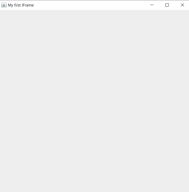
As you can see, we have a basic 600 by 600 pixel window.

Now, how can we add an image to this window? Take a look at this code:

public class Graphics101 {

    public static void main(String[] args) {
        JFrame frame = new JFrame("My first JFrame");
        frame.setSize(600, 600);  
        ImageIcon image1 = new ImageIcon("C:\\Users\\mof39\\Downloads\\xmas\\20211225_163232.jpg");
        frame.add(new JLabel(image1));
        frame.pack();
        frame.setVisible(true);  
        frame.setDefaultCloseOperation(JFrame.EXIT_ON_CLOSE);  
    }
    
}

Pay attention to these three lines of code:

ImageIcon image1 = new ImageIcon("C:\\Users\\mof39\\Downloads\\xmas\\20211225_163232.jpg");
frame.add(new JLabel(image1));
frame.pack();

The ImageIcon line stores the image I want to add as a variable; to add a new object of the ImageIcon class, I’d need to pass in the image’s file path (where it’s located on my computer) as the parameter for the object. The frame.add(new JLabel(image1)) line adds the image to my JFrame; the image1 variable is passed in as the parameter as an object of the JLabel class. The frame.pack() method simply tells Python to display the image on the JFrame.

  • If you’re trying to create an image to add to the JFrame, always create an object of the ImageIcon class-don’t use any other class to create an image to add to the JFrame.
  • Yes, I’m wearing a Santa hat in this photo (it was taken on Christmas Day 2021).

Now, even though we did successfully get the image displayed onto the JFrame, we’ve got an issue-the whole image won’t fit since it’s too big for the JFrame. How can we resize the image so that the whole image fits within the 600×600 pixel JFrame? Take a look at this code:

public class Graphics101 {

    public static void main(String[] args) {
        JFrame frame = new JFrame("My first JFrame");
        frame.setSize(600, 600);  
        JLabel label = new JLabel();
        label.setIcon(new ImageIcon(new ImageIcon("C:\\Users\\mof39\\Downloads\\xmas\\20211225_163232.jpg").getImage().getScaledInstance(600, 600, Image.SCALE_SMOOTH)));
        frame.add(label);
        frame.pack();
        frame.setVisible(true);  
        frame.setDefaultCloseOperation(JFrame.EXIT_ON_CLOSE);  
    }
    
}

As you can see, I managed to get the whole image to fit into the JFrame. How did I do that? Pay attention to these lines of code:

JLabel label = new JLabel();
        label.setIcon(new ImageIcon(new ImageIcon("C:\\Users\\mof39\\Downloads\\xmas\\20211225_163232.jpg").getImage().getScaledInstance(600, 600, Image.SCALE_SMOOTH)));
        frame.add(label)

The JLabel line simply tells Java to add a new JLabel object to the JFrame; I will store the image I want to display in this JLabel.

The JLabel object’s .setIcon() method is the most important method in this group, as it creates the ImageIcon and resizes it to fit the JFrame window (via the .getScaledInstance() method), all in the same line of code. Pretty impressive right?

Now, the .getScaledInstance() method takes in three parameters-the width you want to use for the image (in pixels), the height you want to use for the image (also in pixels), and the scaling algorithm you’d like to use to scale the image to the JFrame-of which there are five: SCALE_DEFAULT, SCALE_FAST, SCALE_SMOOTH, SCALE_REPLICATE, and SCALE_AREA_AVERAGING. Since my JFrame window is 600×600 pixels, I used 600 for both the width and height parameters.

  • In the .getScaledInstance() method, when you’re indicating the scaling algorithm that you want to use, always include Image. before the name of the scaling algorithm (e.g. Image.SCALE_SMOOTH).

The frame.add() method adds the JLabel object to the JFrame; since the resized image is stored in the JLabel object, the frame.add() method adds the resized image to the JFrame. Just as with the previous example, the frame.add() method is followed by the frame.pack() method, which displays the resized image onto the JFrame.

Looks much better. But what if you wanted to resize the image to different dimensions-dimensions that aren’t equal to the size of your JFrame window, in other words. Take a look at this code:

public class Graphics101 {

    public static void main(String[] args) {
        JFrame frame = new JFrame("My first JFrame");
        frame.setSize(600, 600);  
        JLabel label = new JLabel();
        label.setIcon(new ImageIcon(new ImageIcon("C:\\Users\\mof39\\Downloads\\xmas\\20211225_163232.jpg").getImage().getScaledInstance(300, 300, Image.SCALE_SMOOTH)));
        frame.add(label);
        frame.pack();
        frame.setVisible(true);  
        frame.setDefaultCloseOperation(JFrame.EXIT_ON_CLOSE);  
    }
    
}

I used the same code for this example as I did for the previous example, however I did change the first two parameters of the .getScaledInstance() method from 600 and 600 to 300 and 300. You might think that this would simply resize the image, in which case you’d be half-right. The image is resized to 300×300 pixels, but so is the JFrame window. With that said, keep in mind that, whenever you want to resize an image to fit a JFrame, if the dimensions of your resized image aren’t the same as those of your JFrame window, the JFrame window will change its size to match the dimensions of the image set in the .getScaledInstance() method. In this example, since I changed the dimensions of the image to 300×300 pixels, the JFrame’s inital size settings (600×600) will be overwritten to 300×300 pixels.

Thank you for reading. I’ve got tons of great content for you all this year,

Michael

Java Lesson 21: Drawing and Coloring Shapes on the JFrame

Hello everybody,

Michael here, and this post (my last one for 2021) will serve as a continuation of the previous post, but this time, instead of discussing how to draw lines on the JFrame, I’ll discuss how to draw (and color) shapes on the JFrame.

Now, before we start drawing shapes onto our JFrame, let’s create the JFrame and make all the necessary imports (this code will probably seem familiar to you if you read my previous Java lesson):

import javax.swing.*;
import java.awt.*;
import javax.swing.JComponent;


public class Graphics101 {

    public static void main(String[] args) {
        JFrame frame = new JFrame("My first JFrame");
        frame.setSize(600, 600);  
        frame.setDefaultCloseOperation(JFrame.EXIT_ON_CLOSE);  

        frame.setVisible(true);  
    }
    
}

Ok, now that we’ve got our JFrame window set, let’s start drawing some shapes. We’re going to start off by drawing a rectangle:

import javax.swing.*;
import java.awt.*;
import javax.swing.JComponent;

class ShapeDrawing extends JComponent {
  
    public void paint(Graphics g)
    {
        Graphics2D g2 = (Graphics2D) g;
        g2.drawRect(100, 150, 60, 200);
    }
}

public class Graphics101 {

    public static void main(String[] args) {
        JFrame frame = new JFrame("My first JFrame");
        frame.setSize(600, 600);  
        frame.setDefaultCloseOperation(JFrame.EXIT_ON_CLOSE);  
        frame.getContentPane().add(new ShapeDrawing ());
        frame.setVisible(true);  
    }
    
}

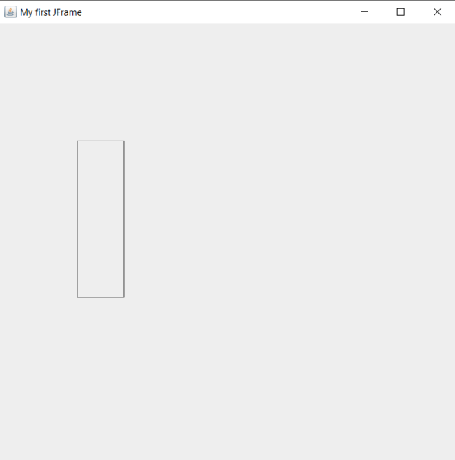
Now, to be able to draw shapes onto the JFrame, I created a new class that contains an object of the Graphics class. I also used a .paint() method that executes the drawing. I did all of this when I was drawing lines onto a JFrame, however for this example I changed the name of the class to ShapeDrawing. Also, just as I did with the LineDrawing class’s .paint() method, I created a separate object of the Graphics class (g2 in this instance); this time, I’m using g2‘s .drawRect() method to draw a rectangle on the JFrame window.

The .drawRect() method takes in four parameters, in the following order:

  • The x-coordinate where the rectangle is located
  • The y-coordinate where the rectange is located
  • The rectangle’s width
  • The rectangle’s height

You’re probably wondering why we don’t need to use two x- and y-coordinates like we did when we were drawing lines. This is because even though we only specified two points for the rectangle, Java will figure out where the other two rectangle points are located through the width and height that we provided in the .drawRect() method.

  • Note-there is no separate .drawSquare() method in Java’s Graphics class. If you wanted to draw a square, use the .drawRect() method. After all, when you think about it, a square is basically a modified rectangle.

Now, for fun, let’s try drawing another shape-let’s do a circle this time (we’ll keep the rectangle we drew-all we’re doing is simply adding a circle onto the screen):

import javax.swing.*;
import java.awt.*;
import javax.swing.JComponent;

class ShapeDrawing extends JComponent {
  
    public void paint(Graphics g)
    {
        Graphics2D g2 = (Graphics2D) g;
        g2.drawRect(100, 150, 60, 200);
        g2.drawOval(185, 235, 80, 220);
    }
}

public class Graphics101 {

    public static void main(String[] args) {
        JFrame frame = new JFrame("My first JFrame");
        frame.setSize(600, 600);  
        frame.setDefaultCloseOperation(JFrame.EXIT_ON_CLOSE);  
        frame.getContentPane().add(new ShapeDrawing ());
        frame.setVisible(true);  
    }
    
}

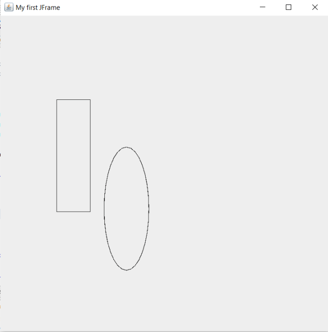
In this example, I added the .drawOval() method to the ShapeDrawing class’s .paint() method. The .drawOval() method has the same four parameters as the .drawRect() method-shape’s x-coordinate, shape’s y-coordinate, shape’s width, and shape’s height-in the same order as the .drawRect() method.

  • Whether you want to draw an oval or a circle onto the JFrame, use the .drawOval() method.

Now, it’s pretty cool that Java has built-in methods for drawing basic shapes such as squares, rectangles, and circles. However, Java has no built-in methods for drawing other polygons such as triangles and hexagons.

Let’s say we wanted to add a triangle to our JFrame. Here’s the code we’ll use:

import javax.swing.*;
import java.awt.*;
import javax.swing.JComponent;

class ShapeDrawing extends JComponent {
  
    public void paint(Graphics g)
    {
        Graphics2D g2 = (Graphics2D) g;
        g2.drawRect(100, 150, 60, 200);
        g2.drawOval(185, 235, 80, 220);
        int x[] = {400, 400, 500};
        int y[] = {100, 200, 200};
        int numPoints = 3;
        g.drawPolygon(x, y, numPoints);
    }
}

public class Graphics101 {

    public static void main(String[] args) {
        JFrame frame = new JFrame("My first JFrame");
        frame.setSize(600, 600);  
        frame.setDefaultCloseOperation(JFrame.EXIT_ON_CLOSE);  
        frame.getContentPane().add(new ShapeDrawing ());
        frame.setVisible(true);  
    }
    
}

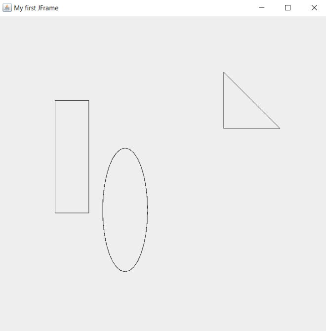
How did I add the right triangle to the JFrame? Pay attention to the four lines of code in the .paint() method that follow the g2.drawOval() line. The lines of code that begin with int x[] and int y[] create arrays that store the polygon’s x- and y-coordinates, respectively. Each point in the int x[] array corresponds to the point in the same position in the int y[] array-for instance, the first element in the int x[] array (400) corresponds to the first element in the int y[] array (100). This means that the first point in the traingle would be (400, 100); likewise, the other two points would be (400, 200) and (500, 200).

  • Something to keep in mind when you’re creating your x- and y-coordinate arrays is to keep them the same length. Also, only include as many elements in these arrays as there are points in the polygon you plan to draw. In this case, since I’m drawing a traingle onto the JFrame, I shouldn’t add more than 3 elements to either the x-coordinate or y-coordinate arrays.

After creating my x- and y-coordinate arrays, I also included a numPoints variable that simply indicates how many points I will include in the polygon-3 in this case, after all I’m drawing a triangle. Last but not least, use the .drawPolygon() method to draw the traingle and pass in the x- and y-coordinate arrays along with the numPoints variable as this method’s parameters.

  • One more thing to note about the .drawPolygon() method-both g and g2 have this as a method. Use the g version (which represents Java’s Graphics class), as in g.drawPolygon(x, y, numPoints). The g2 (which represents Java’s Graphics2D class-Graphics2D is a subclass of the Graphics class) version of this method won’t work as well.

Great! We managed to draw three shapes onto our JFrame! However, they look awfully dull. Let’s see how to add some color to each shape:

import javax.swing.*;
import java.awt.*;
import javax.swing.JComponent;

class ShapeDrawing extends JComponent {
  
    public void paint(Graphics g)
    {
        Graphics2D g2 = (Graphics2D) g;
        g2.setColor(Color.BLUE);
        g2.drawRect(100, 150, 60, 200);
        g2.fillRect(100, 150, 60, 200);
        
        g2.setColor(Color.ORANGE);
        g2.drawOval(185, 235, 80, 220);
        g2.fillOval(185, 235, 80, 220);
        
        g.setColor(Color.YELLOW);
        int x[] = {400, 400, 500};
        int y[] = {100, 200, 200};
        int numPoints = 3;
        g.drawPolygon(x, y, numPoints);
        g.fillPolygon(x, y, numPoints);
    }
}

public class Graphics101 {

    public static void main(String[] args) {
        JFrame frame = new JFrame("My first JFrame");
        frame.setSize(600, 600);  
        frame.setDefaultCloseOperation(JFrame.EXIT_ON_CLOSE);  
        frame.getContentPane().add(new ShapeDrawing ());
        frame.setVisible(true);  
    }
    
}

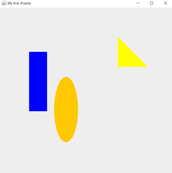
As you can see, we now have a blue rectangle, orange oval, and yellow right triangle on the JFrame. How did I accomplish this?

Well, for the rectangle, I used the .setColor() method and passed in Color.BLUE as the parameter. You might think this method alone would do the trick, however, this method merely set’s the shape’s border color to blue-it doesn’t actually fill in the shape. That’s why we need to use the .fillRect() method to fill the rectangle; like the .drawRect() method, this method also takes in four parameters. To fill in the rectangle, pass in the same four integers that you used for the .drawRect() method in the same order that they are listed in the .drawRect() method. In this case, I used the integers 100, 150, 60 and 200 for both the .drawRect() and .fillRect() methods.

  • With regards to the .fillRect() method, execute this after executing the .drawRect() method. However, still execute the .setColor() method before executing the .drawRect() method.

To fill in the oval and the triangle, I used the same logic I used to fill in the rectangle. However, to fill in the oval, I used the .fillOval() method and passed in the same` four points (in the same order) that I used for the .drawOval() method-185, 235, 80 and 220. I also called the .setColor() method to set the oval’s color before I ran the .drawOval() method-much like I did when I set the color of the rectangle.

To fill in the triangle, I used the .fillPolygon() method and passed in the same three parameters (in the same order) that I used for the .drawPolygon() method-x, y, and numPoints. And, just like I did for the oval and rectangle, I executed the .setColor() method before running the draw and fill methods.

Since this is my last 2021 post, thank you all for reading my content this year (and every year)! I hope you had just as much fun learning new programming skills (or honing existing ones) as I did making this content. Can’t wait to share all the amazing programming content I have planned with you all in 2022! In the meantime, have a very merry holiday season,

Michael

Java Lesson 20: Lines, Colors, and Basic Java Graphics

Hello everybody,

Michael here, and I’ve got an exciting Java lesson for you guys. Today, I’ll not only be covering how to work with lines and colors in Java but I’ll also be giving you guys an introduction to working with graphics in Java.

First, let’s discuss how to work with one of Java’s most important graphics classes-JFrame. The JFrame class allows you to create Java windows where you can add whatever graphics you want. Let’s create a simple JFrame object:

import javax.swing.JFrame;   
public class Graphics101 {

    public static void main(String[] args) {
        JFrame frame = new JFrame("My first JFrame");  
        frame.setSize(600, 600);  
        frame.setDefaultCloseOperation(JFrame.EXIT_ON_CLOSE);  
        frame.setVisible(true);  
    }
    
}

And watch what appears when you run this code:

As you can see, a blank 600X600 window appears that serves as your programming canvas, where you can create whatever coding artistry you can imagine.

Now, how did this code manage to create this window? Well, for starters, we’d need to import the JFrame class in order to create a JFrame object; the line of code to import this class is import javax.swing.JFrame;. Next, as you all may have figured out, we’d need to create an object of the JFrame class (called frame in this example) in order to create a new JFrame window. In the JFrame object I created, I passed in the String parameter My first JFrame-this sets the title of the window as “My first JFrame”. I then used three JFrame class methods-.setSize(), .setDefaultCloseOperation(), .setVisible()-to fine-tune the window I’m creating.

Here’s a breakdown of each of these methods:

  • .setSize()-This method takes two integer parameters; the first parameter for width and the second parameter for height (both in pixels). These two parameters set the initial size of the JFrame window.
  • .setDefaultCloseOperation()-This method takes in a predefined constant from the JFrame class; oftentimes, that predefined constant is EXIT_ON_CLOSE, which simply closes the window when you click the X on the window’s upper right hand corner.
  • .setVisible()-This method simply takes in a boolean that tells the code whether or not to display the window when the code is run.

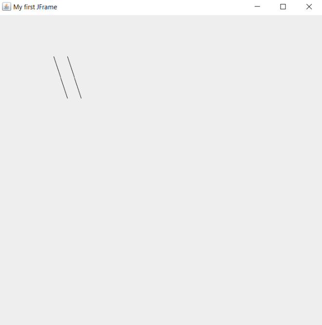
The blank JFrame is a great start, however, it looks awfully dull without anything on it. Before we start drawing cool shapes, let’s first draw a few lines onto our JFrame:

import javax.swing.*;
import java.awt.*;
import javax.swing.JComponent;

class LineDrawing extends JComponent {
  
    public void paint(Graphics g)
    {
        g.drawLine(100, 75, 125, 150);
        g.drawLine(125, 75, 150, 150);
    }
}

public class Graphics101 {

    public static void main(String[] args) {
        JFrame frame = new JFrame("My first JFrame");
        frame.setSize(600, 600);  
        frame.setDefaultCloseOperation(JFrame.EXIT_ON_CLOSE);  
        frame.getContentPane().add(new LineDrawing ());
        frame.setVisible(true);  
    }
    
}

Now let’s take a look at the lines that were generated:

In this example, I used the same code from the previous example to create the JFrame. However, you’ll notice some differences from the previous example’s code. First of all, I did use asterisks (*) in the import statements. Using asterisks for imports in programming (any program, not just Java) is a practice known as star importing-this is where you import all the classes in a particular package or sub-package rather than importing the classes you need one-by-one. Some programmers aren’t fond of star imports and claim it’s bad practice, but I personally find them to be a more efficient method of importing.

The other difference between this code and the previous example’s code is that there is another class above the main class. The other class I created-LineDrawing-extends Java’s JComponent class, which means that my LineDrawing class will be able to access all of the JComponent class’s methods (which we need for line drawing).

My LineDrawing class contains a single method-paint()-which takes in a single parameter-g, which is an object of Java’s Graphics class (which is imported through the star import I used for Java’s java.awt package). The paint() method draws two parallel lines on the JFrame object I created. But how does paint() exactly draw the lines on the JFrame object? Pay attention to this line of code-frame.getContentPane().add(new LineDrawing ()). This line of code allows us to draw the lines on the JFrame window through using the .getContentPane() and .add() methods. In the .add() method, I passed in new LineDrawing() as this method’s parameter; this line of code creates a new object of the LineDrawing class inside the JFrame object. The LineDrawing class object will automatically activiate the class’s paint() method, which will draw the two parallel lines inside the JFrame window.

Now, you’re probably wondering how the .drawLine() method exactly works. This method takes in four parameters, which can be either integers or decimals. The first and third parameters represent the x-coordinates of the first and second point in the line, respectively. The second and fourth parameters represent the y-coordinates of the first and second point in the line, respectively. In this example, the four parameters I passed into the first line were 100, 75, 125, and 150-this means that the first line’s endpoints will be located at (100, 75) and (125, 150).

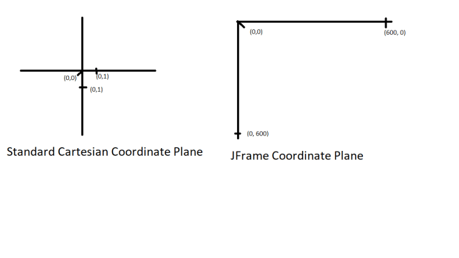
Now, there’s something that you should keep in mind when dealing with JFrame coordinates. JFrame doesn’t go by the same coordinate plane that you likely learned about in pre-algebra class. Rather, JFrame uses it’s own coordinate plane where all x- and y-axis values are positive and the axis values (for both axes) range from 0 to the height and width of the window (in pixels). In this case, since the JFrame window I created is 600×600 pixels, the value ranges for both axes would be from 0 to 600.

Here’s an illustration to show the difference between a standard coordinate plane and a JFrame coordinate plane:

A standard (or Cartesian) coordinate plane contains four quadrants-two of which contain one positive and one negative coordinate (such as (3, -2) or (-4, 5)). The other two quadrants contain either two positive coordinates or two negative coordinates (such as (4, 1) or (3, 3)).

A JFrame coordinate plane, on the other hand, only contains one quadrant which can only contain two positive coordinates (such as (15,20) or (35, 30)). Since JFrame coordinate planes only contain positive integers, trying to run a line of code like this g.drawLine(-100, 75, -125, 150) would give you an error since JFrame coordinate planes have no negative coordinates on either the x- or y-axis. Another difference between JFrame coordinate planes and standard Cartesian coordinate planes is that Cartesian coordinate planes can stretch on to infinite lengths while JFrame coordinate planes can only stretch as far as the window’s pixel size. In this example, the JFrame window is set to a size of 600×600 pixels, which means that the maximum possible value on both the x-axis and y-axis is 600. Thus, the maximum possible coordinate for our window would be (600, 600).

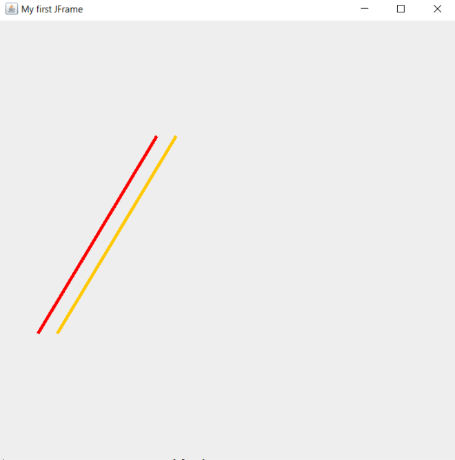
Now, it’s pretty impressive that we managed to draw our own lines on the console. However, the lines look quite boring. What if you wanted to add some color to the lines? Here’s the code to do so (note: I made the lines bigger than they were in the previous example):

import javax.swing.*;
import java.awt.*;
import javax.swing.JComponent;

class LineDrawing extends JComponent {
  
    public void paint(Graphics g)
    {
        g.setColor(Color.RED);
        g.drawLine(50, 400, 200, 150);
        g.setColor(Color.ORANGE);
        g.drawLine(75, 400, 225, 150);
    }
}

public class Graphics101 {

    public static void main(String[] args) {
        JFrame frame = new JFrame("My first JFrame");
        frame.setSize(600, 600);  
        frame.setDefaultCloseOperation(JFrame.EXIT_ON_CLOSE);  
        frame.getContentPane().add(new LineDrawing ());
        frame.setVisible(true);  
    }
    
}

In this example, I still draw the lines onto the window through the LineDrawing class’s paint() method. However, I did add two lines of code to the paint() method-both of these lines contain the Graphics class’s .setColor() method and pass in Color.[name of color] as the method’s parameter. In this case, passing in a HEX code, RGB code, or HSL value won’t work here; you’ll need to use the exact name of a color. Java’s Graphics class has several predefined colors; you can see which colors are available to you through a quick scroll of the Intellisense window that appears after you type Color.. In this example, I set the colors of the two lines to RED and ORANGE, respectively.

  • Something to keep in mind when setting the colors for lines-run the .setColor() method BEFORE running the .drawLine() method. You’ll want to set the color of the line before actually drawing it onto the JFrame.

Now, what if you wanted to add some more style to the lines you created? Let’s say you wanted to change the lines’ thickness. Here’s the code to do so (note: I didn’t change line sizes this time):


import javax.swing.*;
import java.awt.*;
import javax.swing.JComponent;

class LineDrawing extends JComponent {
  
    public void paint(Graphics g)
    {
        Graphics2D g2 = (Graphics2D) g;
        g.setColor(Color.RED);
        g2.setStroke(new BasicStroke(4));
        g.drawLine(50, 400, 200, 150);
        g.setColor(Color.ORANGE);
        g2.setStroke(new BasicStroke(4));
        g.drawLine(75, 400, 225, 150);
    }
}

public class Graphics101 {

    public static void main(String[] args) {
        JFrame frame = new JFrame("My first JFrame");
        frame.setSize(600, 600);  
        frame.setDefaultCloseOperation(JFrame.EXIT_ON_CLOSE);  
        frame.getContentPane().add(new LineDrawing ());
        frame.setVisible(true);  
    }
    
}

As you may have noticed, I did make some modifications to the previous example’s code. First of all, I did create a new object of the Graphics class in the .paint() method-g2. All this does is allow us to have access to more Graphics class methods, which we’ll need for this code.

The new Graphics class method we’ll be using is .setStroke(), which allows us to set a line’s thickness (in pixels). The parameter you’d use for the .setStroke() method is new BasicStroke (int)-with int being the thickness (in pixels) you want to use for the line. In this example, I used 4 (pixels) as the thickness for both lines.

Last but not least, let’s explore how to make our lines dotted. Here’s the code we’ll be using to do just that:

import javax.swing.*;
import java.awt.*;
import javax.swing.JComponent;

class LineDrawing extends JComponent {
  
    public void paint(Graphics g)
    {
        Graphics2D g2 = (Graphics2D) g;
        g.setColor(Color.RED);

        float[] dashingPattern = {12f, 6f};
        Stroke stroke = new BasicStroke(5, BasicStroke.CAP_BUTT, BasicStroke.JOIN_MITER, 1.0f, dashingPattern, 0.0f);
        g2.setStroke(stroke);
        g.drawLine(50, 400, 200, 150);
        
        g.setColor(Color.ORANGE);

        float[] dashingPattern2 = {9f, 5f};
        Stroke stroke2 = new BasicStroke(5, BasicStroke.CAP_BUTT, BasicStroke.JOIN_MITER, 1.0f, dashingPattern2, 0.0f);
        g2.setStroke(stroke2);
        g.drawLine(75, 400, 225, 150);
    }
}

public class Graphics101 {

    public static void main(String[] args) {
        JFrame frame = new JFrame("My first JFrame");
        frame.setSize(600, 600);  
        frame.setDefaultCloseOperation(JFrame.EXIT_ON_CLOSE);  
        frame.getContentPane().add(new LineDrawing ());
        frame.setVisible(true);  
    }
    
}

    public static void main(String[] args) {
        JFrame frame = new JFrame("My first JFrame");
        frame.setSize(600, 600);  
        frame.setDefaultCloseOperation(JFrame.EXIT_ON_CLOSE);  
        frame.getContentPane().add(new LineDrawing ());
        frame.setVisible(true);  
    }
    
}

In this example, there is another addition to the code. This time around, I added three lines of code before each .drawLine() method call. The first line creates a floating-point list that defines each line dash pattern. Each list takes two values-both floating-point numbers (and both ending with f). The first value of each list specifies the length of each dash (in pixels) and the second value of each list specifies the space between each dash (also in pixels).

The second new line of code creates an object of the Stroke class; for an explanation of each parameter in the object of the Stroke class, refer to this Oracle documentation-https://docs.oracle.com/javase/7/docs/api/java/awt/BasicStroke.html#BasicStroke(float,%20int,%20int,%20float,%20float[],%20float).

The third new line simply calls the .setStroke() method and passes in the Stroke object we created in the previous line.

  • Keep in mind that you’d always want to set the styling for your lines (e.g. color, thickness, dashing) before you draw the line in your JFrame.

As you can see, we have succesfully created dashed lines in our JFrame.

Thanks for reading,

Michael
Java Lesson 19: Fun with Dates and Times (in Java)

Hello everybody,

Michael here, and today I’ll be sharing a fun Java lesson on the use of dates and times in Java. I already covered date and time manipulation for both Python and R, but here’s the Java version of this concept.

Now, since the last time I posted a Java lesson, I got a new laptop, but I still plan to use NetBeans as my main IDE for these posts.

When working with dates and times in Java, keep in mind that unlike in Python, Java doesn’t have a single Date class/module that you can easily import or pip install. Java does have a java.time package which allows you to work with date/time manipulation. However, unlike with Python, you can’t import the whole package at once and expect to be able to use all of the package’s classes just like that. Rather, you’ll need to import all the package’s classes (the classes that you want to use) one by one-this is one of the major disadvantages of Java.

To start off our exploration of Java date-time manipulation, let’s first explore the Clock class of the java.time package. Some of the things that the Clock class can do is print out the current time (in both UTC and other time zones) and retrieve your current time zone-both of which would be useful when developing applications that deal with time zones. Execute this code and see what happens:

import java.time.Clock;
public class DateTime {

    public static void main(String[] args) 
    {
        Clock c = Clock.systemDefaultZone();
        System.out.println(c);
    }
    
}

SystemClock[America/Chicago]

Now, what exactly does this code do? Well, it creates an object of the Clock class and prints out the value of the object.

You’re likely wondering what systemDefaultZone is. It’s one of several methods in the Clock class. You can’t create an object of the Clock class on it’s own-by that I mean you can’t create a Clock object that looks like this: Clock c = Clock(). You’ll need to use of the class’s methods-in this case, I used the systemDefaultZone method. All this method does is print out the time zone your computer uses. Since I am in Nashville, TN right now, my system default [time] zone is [America/Chicago], as Chicago also uses Central Standard Time.

The Clock class has other methods, which you can find on this documentation from Oracle-https://docs.oracle.com/javase/8/docs/api/java/time/Clock.html. Explore this website for links related to some of the other classes that I will be discussing in this post.

Next up, let’s discuss the LocalDate class. This class allows you to display dates, but not datetimes or time zones. To start exploring the LocalDate class, let’s first create a simple LocalDate object:

import java.time.LocalDate;
public class DateTime {

    public static void main(String[] args) 
    {
        LocalDate ld = LocalDate.now();
        System.out.println(ld);
    }
    
}

2021-11-15

In this example, I created a simple LocalDate object that prints out today’s date using the .now() method (I ran this code on November 15, 2021). Just as with the Clock class, whenever you create a new object of the LocalDate class, you’ll need to include a class method with your object creation; in this case, I used the now() method of the LocalDate class.

Now, let’s explore some more methods of the LocalDate class by executing this code:

import java.time.LocalDate;
public class DateTime {

    public static void main(String[] args) 
    {
        LocalDate ld = LocalDate.now();
        System.out.println(ld.plusMonths(3));
        System.out.println(ld.getDayOfWeek());
        System.out.println(ld.isLeapYear());
        System.out.println(ld.toEpochDay());
    }
    
}

2022-02-15
MONDAY
false
18946

In this example, I still created a LocalDate object called ld that uses the LocalDate class’s .now() method. However, I added four output lines (referenced with System.out.println()) which generate four different outputs based on four different methods. Here’s an explanation of each output:

  • The first output-2022-02-15-was generated through the LocalDate class’s .plusMonths() method. The .plusMonths() method takes in one parameter-an integer that tells Java how many months to add to the date in the LocalDate object. In this case, I passed in 3 as the parameter of the .plusMonths() method, which tells Java to add 3 months to today’s date-the output is February 15, 2022.
  • The second output-MONDAY-was generated through the .getDayOfWeek() method, which in this case retrieves the current date’s day of the week. November 15, 2021 is a Monday, therefore this method will return MONDAY.
    • Recall that the current date in this example is November 15, 2021.
  • The third output-false-was generated through the .isLeapYear() method, which in this case returns either true or false depending on whether the current year is a leap year. Since 2021 isn’t a leap year, this method returned false.
  • The fourth output-18946-was generated through the interesting .toEpochDay() method. You wouldn’t need to use the .toEpochDay() method much, but I’ll discuss it here anyway. This method simply returns the number of days its been since January 1, 1970-the “epoch time” for computers. Why January 1, 1970? It’s basically an arbitrary date that serves as the “zero point” (or default time) for most operating systems.
    • On my old laptops, when the operating system was having issues, the system date would always be set to January 1, 1970.

Now that we’ve explored the LocalDate class a bit, let’s move on to the LocalTime class. LocalTime is basically the opposite of LocalDate since LocalTime only displays times and timestamps but no dates.

Let’s create a simple LocalTime object using the code below:

import java.time.LocalTime;
public class DateTime {

    public static void main(String[] args) 
    {
        LocalTime lt = LocalTime.now();
        System.out.println(lt);
    }
    
}

21:13:50.623089

Similar to the LocalDate example, I created a LocalTime object using the .now() method. And in case you hadn’t figured it out by now, you can’t create a LocalTime object without including a class method (just as you needed a class method for the Clock and LocalDate objects)

In this case, the LocalTime object I created printed out the current (at runtime) time as set on my laptop-21:13:50.623089. I ran the code at 9:13PM Central Standard Time, but Java will print out the time in 24-hour format (and 21 represents the 9PM hour).

Now, let’s explore four other methods of the LocalTime class (you’ll notice that this code looks syntactically similar to the code in the previous example):

import java.time.LocalDate;
import java.time.LocalTime;
import java.time.ZoneOffset;
public class DateTime {

    public static void main(String[] args) 
    {
        LocalTime lt = LocalTime.now();
        System.out.println(lt);
        System.out.println(lt.plusHours(6));
        System.out.println(lt.minusMinutes(45));
        System.out.println(lt.toNanoOfDay());
        System.out.println(lt.toEpochSecond(LocalDate.MAX, ZoneOffset.UTC));
    }
    
}

21:35:06.320094400
03:35:06.320094400
20:50:06.320094400
77706320094400
31556889832772106

Now, just as I did with the four methods in the LocalDate example, let’s explore the four methods I used here:

  • Below the lt output, you’ll see the output 03:35:06.320094400, which was generated from the .plusHours() method. This method takes in an integer parameter (6 in this case) and add that many hours to the current time-in this case, 6 hours from the current [run]time is 3:35AM.
  • The next output is 20:50:06.320094400, which was generated from the .minusMinutes() method. Like the .plusHours() method, the .minusMinutes() method takes in an integer (45 in this case) as the parameter. However, the .minusMinutes() method subtracts a certain amount of minutes from the LocalTime object-in this case, 45 minutes before the current [run]time is 10:50PM.
  • The next output is 77706320094400, which was generated from the .toNanoOfDay() method. This method returns the nanosecond of the current time. In this case, 9:35:06PM is roughly the 77.7 trillionth nanosecond of the day. If the current time was 12:00:00AM, the .toNanoOfDay() method would return 1, as this time would be the first nanosecond of the day.
    • Just so you know, 1 second is equal to a billion nanoseconds.
  • The last output is 31556889832772106, which was generated from the .toEpochSecond() method. This method is conceptually similar to the .toEpochDay() method, since both methods return the amount of time in a certain unit (days or second) since January 1, 1970. However, .toEpochSecond() returns the amount of seconds that have passed since January 1, 1970 at 12:00:00AM, which in this case is roughly 31.6 quadrillion seconds.
    • The ZoneOffset class was needed for the .toEpochDay() method, but don’t worry about it otherwise.

Next up, let’s explore the LocalDateTime class. You might be able to figure out what this class does based off the class name alone, but in case you didn’t, this class displays date-time objects-which are objects that display dates and times (in the same string).

As I did for both LocalDate and LocalTime, I will create a simple object of the LocalDateTime class using the .now() method:

import java.time.LocalDateTime;
public class DateTime {

    public static void main(String[] args) 
    {
        LocalDateTime ldt = LocalDateTime.now();
        System.out.println(ldt);
    }
    
}

2021-11-20T07:22:10.017889200

This example prints out the current date-time (at runtime)-November 20, 2021 at 7:22AM.

Now, let’s explore four different methods of the LocalDateTime class:

import java.time.LocalDateTime;
public class DateTime {

    public static void main(String[] args) 
    {
        LocalDateTime ldt = LocalDateTime.now();

        System.out.println(ldt.minusDays(60));
        System.out.println(ldt.plusMonths(4));
        System.out.println(ldt.withDayOfYear(60));
        System.out.println(ldt.getDayOfMonth());
    }
    
}

2021-09-21T07:29:56.515749900
2022-03-20T07:29:56.515749900
2021-03-01T07:29:56.515749900
20

Let’s explore each of the methods and their corresponding outputs:

  • The first output-2021-09-21T07:29:56.515749900-was generated through the LocalDateTime class’s .minusDays() method, which in this example takes in an integer as a parameter and subtracts that amount of days from the current date-time. In this case, 60 days subtracted from the current date-time equals September 21, 2021 at 7:29AM.
  • The second output-2022-03-20T07:29:56.515749900-was generated through the LocalDateTime class’s .plusMonths() method. Like the .minusDays() method, this method takes in an integer parameter; however, this method will add a certain number of months to the current date-time. In this case, 4 months added to the current date-time equals March 20, 2022 at 7:29AM.
  • The third output-2021-03-01T07:29:56.515749900-was generated through the .withDayOfYear() method. This is one of the LocalDateTime class’s more interesting methods since it oftentimes returns a different date from the date in the date-time object. This method, like the previous two I discussed, takes in an integer as a parameter; in this case, the method will return the date corresponding to the Xth day of the year. Since I passed 60 as the integer parameter, this method will return the date March 1, 2021 (the time part of the date-time object remains unchanged). Had I wrote and ran this code last year, this method would’ve returned February 29, 2020, as February 29 is the 60th day of the year in leap years.
  • The last output-20-was generated through the .getDayOfMonth() method. In this case, the method simply retrieves the day of the month of the current datetime; since the current date [as of runtime] is November 20, 2021, this method will return 20 since it’s currently the 20th day of the month.

Last but not least, let’s explore the DateTimeFormatter class. This class is different from the previous three classes we discussed because unlike those three classes, this class doesn’t return a datetime object. Rather, this class generates a formatted datetime object from an exisiting datetime object. Let me demonstrate this concept with the code below:

import java.time.LocalDateTime;
import java.time.format.DateTimeFormatter;
public class DateTime {

    public static void main(String[] args) 
    {
        LocalDateTime ldt = LocalDateTime.now();
        System.out.println("DateTime before formatting: " + ldt);
        DateTimeFormatter dtf = DateTimeFormatter.ofPattern("MM-dd-yy HH:mm");
        String formattedDateTime = ldt.format(dtf);
        System.out.println("DateTime after formatting: " + formattedDateTime);
    }
    
}

DateTime before formatting: 2021-11-28T09:01:48.974227300
DateTime after formatting: 11-28-21 09:01

Ok, so this example looks more complicated than our previous examples. As you can see from the code above, to be able to format a datetime object, we first need to create a datetime object of the LocalDateTime class.

Next, we’d need to create a datetime formatter object using the DateTimeFormatter class. We’d use this class’s .ofPattern() method and pass in a String pattern as the method’s parameter. In this example, I passed the pattern MM-dd-yy HH:mm into the .ofPattern() method; this pattern will display the datetime object with the date portion being displayed month first (followed by the day and year) and the time portion being displayed with just the hour and minute.

  • When specifying a datetime pattern to use for the .ofPattern() method, the month (MM) and hour (HH) will always be written with capital letters.
  • If you wanted to incorporate the full year into the output (2021 as opposed to just 21), you’ll need to write yyyy in place of yy.

Now, as you may have figured out from the code, the datetime formatter will only specify the pattern to use for the datetime object-the formatter (dtf) won’t actually format the DateTime object. Take a look at the line of code with the formattedDateTime object. In order to actually format the LocalDateTime object (ldt), you’ll need to use that object’s .format() method and pass in the object containing the pattern you want to use (dft in this case) as the .format() method’s parameter.

I also included two output lines-one that shows the current datetime before formatting and another one that shows the current datetime after formatting. Since I ran this code at 9:01AM Eastern Standard Time on November 28, 2021, the datetime object after formatting is 11-28-21 09:01.

Thanks for reading,

Michael
Colors in Programming

Hello everybody,

Michael here, and today’s lesson will be a little different from my usual content. See, I won’t cover any coding technique per se, but as you may have guessed from the title, I’ll be discussing colors in programming. And no, this won’t be a preschooler’s lesson on color, nor will this be an art-class lesson on color-this is directed towards programmers (who will likely need to know how to use colors in their applications no matter what tool you use for development).

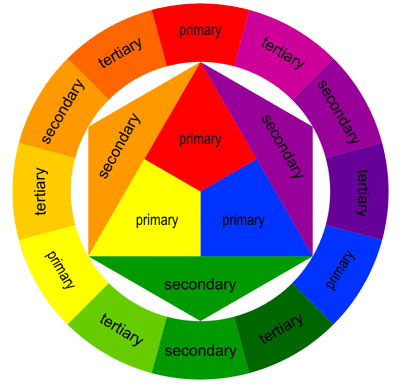
First of all, before we start discussing colors in programming, let’s get into a little history lesson. In 1666, Sir Issac Newton developed his theory that all colors are made up of mixtures of red, green, and blue light. Here’s a picture of that color wheel:

https://www.google.com/url?sa=i&url=https%3A%2F%2Fwww.the-scientist.com%2Ffoundations%2Fnewtons-color-theory-ca-1665-31931&psig=AOvVaw0Rhnfp6Abx_fTYLkHxywJB&ust=1636428109116000&source=images&cd=vfe&ved=0CAsQjRxqFwoTCJikrPjnh_QCFQAAAAAdAAAAABAD

And here’s a more modern interpretation of the color wheel:

https://www.google.com/url?sa=i&url=https%3A%2F%2Fuxplanet.org%2Fanalogous-colors-and-color-wheel-609a05b5b90e&psig=AOvVaw28hxAuUrzxPNZcVud3tC1T&ust=1636428142353000&source=images&cd=vfe&ved=0CAsQjRxqFwoTCOD6kIPoh_QCFQAAAAAdAAAAABAG

In programming (and in general), the three primary colors are red, green, and blue (which you can see from the color wheel above). Secondary colors, such as orange and purple, are created by mixing two primary colors together. Tertiary colors, such as light orange and dark green, are created by mixing a primary and a secondary color together.

Now that we’ve covered some very basic color theory concepts, let’s start discussing how to use colors in programming.

To really understand how colors are used in programming, we’ll cover four basic programming color schemes-RGB, HEX, HSL, and CMYK. Don’t worry-I’ll explain each of these color schemes in detail.

First, let’s discuss the RGB color scheme. As to what RGB stands for, it may be obvious to some of you, but for those who don’t know, RGB stands for red, green, blue. Remember how I said that Newton theorized that all colors are created from some mixture of red, green, and blue light? This color scheme exemplifies that theory, as it allows you to create colors based off a combination of red, green, and blue.

How would that work exactly? Well, RGB color values are usually specified as RGB(red, green, blue). The red, green, and blue parameters in the RGB() function defines the intensity of the red, green, or blue you want to use in a particular color; the intensity is represented as an integer between 0 and 255.

For instance, pure red would be represented by the RGB code RGB(255, 0, 0):

So how did RGB(255, 0, 0) generate a pure red? Well, since the red value is 255 and the green and blue values are 0, this indicates a pure red color will be generated, as the red value is as high as it can be-255.

Similarly, RGB(0, 255, 0) will generate a pure green and RGB(0, 0, 255) will generate a pure blue.

Now, how would you generate pure black and pure white? Here’s what pure black would look like:

To generate pure black, use the RGB code RGB(0, 0, 0). To generate pure white, use the RGB code RGB(255, 255, 255).

Now, what if you wanted to generate a color that wasn’t red, blue, green, black or white? Let’s say you wanted to create orange with the RGB color scheme. Here’s what pure orange would look like:

To create pure orange, I used the RGB code RGB(255, 165, 0).

Next, let’s discuss the HEX color scheme. In the HEX color scheme, colors are represented with hexadecimal numbers, which include the numbers 0-9 and the letters A-F (for a refresher on the hexadecimal numbering system, refer to this entry-Java Lesson 5: Java Numbering Systems-an oldie but a goodie).

The HEX color scheme is similar to the RGB color scheme since both color schemes generate colors from some combination of red, blue, and green. HEX colors are represented as #RRGGBB, with red (RR), green (GG) and blue (BB). Also, just like RGB colors, the intensities of the red, green, and blue colors are represented by a range of integers, but unlike the color intensities of RGB colors, HEX color intensities are represented by hexadecimal integers ranging from 00 (least intense) to FF (most intense). For instance, let’s say you wanted to generate pure red via the HEX color scheme. Here’s the hex code you would use-#FF0000. The hex code #FF0000 generates the same color as the RGB code RGB(255, 0, 0)-that’s because in both cases, the red in each color code is at its most intense value (255 for the RGB code, FF for the HEX code). Similar to the pure red example I just discussed, to generate pure green, use the HEX code #00FF00 and to generate pure blue, use the HEX code #0000FF.

  • If you want to create a HEX color, then always remember to place the pound sign/hashtag/whatever you want to call it (#) in front of the color HEX code. If you don’t do this, the program you’re working with (whether Python, HTML, etc.) won’t know you’re trying to create a color.

Don’t believe me? Well, let’s take a look at the pure red, pure green, and pure blue generated from HEX:

Pure red:

Pure green:

Pure blue:

Now, what if you wanted to generate pure black and pure white using the HEX color scheme? For pure black, use the hex code #000000 and for pure white, use the hex code #FFFFFF.

Next, let’s discuss the HSL color scheme. This color scheme is different from the previous two because in the HSL color scheme, colors aren’t generated from a combination of red, green, and blue. HSL stands for hue, saturation, and lightness. Hue refers to a degree on the color wheel that is represented by an integer between 0 and 360-0 refers to red, 120 to blue, and 240 to green. Saturation refers to the percentage of grey in a certain color; it is represented as a percentage value from 0-100%. 0% means there is a shade of grey in a certain color while 100% means there is no grey in the color. Lightness refers to percentage of, well, light in a certain color. 0% means a pure black color while 100% means a pure white color.

So, what would pure red, pure green, and pure blue look like with the HSL color scheme. Let’s take a look:

Here’s how pure red looks with the HSL color scheme:

To generate pure red with the HSL color scheme, use the code HSL(0, 100%, 50%)-and yes, you’ll need to remember to include the percent signs.

Now, if you wanted to generate pure green with the HSL color scheme, use the code HSL(120, 100%, 50%). Likewise, if you wanted to generate pure blue with the HSL color scheme, use the code `HSL(200, 100%, 50%).

Now, what if you wanted to generate pure black and pure white with the HSL color scheme? To generate pure white, use the code HSL(0, 100%, 100%). To generate pure black, use the code HSL(0, 0%, 0%).

Last but not least, I’ll discuss the CMYK color scheme. The CMYK color scheme is similar to the RGB color scheme since both color schemes generate colors from combinations of other colors. However, unlike with RGB colors, CMYK colors are generated from a combination of cyan, magenta, yellow, and key black. Also, RGB colors are mainly used by computer screens to display content onscreen while CMYK colors are mainly used by printers to present printed content.

  • In case you guys didn’t know, cyan is a shade of blue, magenta is a shade of pink, and key black refers to the type of black color used in printer ink cartridges.

CMYK colors are represented as percentages (from 0% to 100%) of cyan, magenta, yellow, and key black. To generate a CMYK color, use this code-CMYK(100%, 0%, 0%, 0%); this code generates pure cyan.

  • When generating CMYK colors, always remember to include the percent signs!!

Now, what if you wanted to generate pure red? It’s a little different with the CMYK color scheme because, unlike with the RGB and HEX color schemes, colors aren’t being generated as a combination of red, green, and blue. Now, to generate pure red with the CMYK color scheme, use the code CMYK(0%, 100%, 100%, 0%). This code tells your program to use 0% cyan, 100% magenta, 100% yellow, and 100% key black to create the pure red.

To create pure green using the CMYK color scheme, use the code CMYK(100%, 0%, 100%, 0%). To create pure blue using the CMYK color scheme, use the code CMYK(100%, 100%, 0%, 0%).

Now, what if you wanted to create pure black and pure white with the CMYK color scheme? To create pure black, use the code CMYK(0%, 0%, 0%, 100%). This makes sense, as you’d need 100% key black to create pure black. Now, to create pure white, use the code CMYK(0%, 0%, 0%, 0%).

Now that I’ve discussed each of the color schemes, let’s discuss another important color-related tool in programming-color palettes. Color palettes are simply collections of colors used in a single medium-such as a website, a piece of art, a three piece suit collection, etc. For the purposes of this blog, we’ll focus on color palettes in a programming context. Color palettes are widely used in programming to set the design of a particular application (like the design company webpage). Many large companies, such as Google, Netflix, and Amazon, among others, use color palettes for their logos and websites.

Even sports teams use their own color palettes. The Cleveland Browns NFL team uses a 3-color color palette-brown, orange, and white (as you can see on their uniforms below):

https://www.google.com/url?sa=i&url=https%3A%2F%2Fen.wikipedia.org%2Fwiki%2FCleveland_Browns&psig=AOvVaw0KI_qwSJ9W9gL7t3jAMWw9&ust=1636428160939000&source=images&cd=vfe&ved=0CAsQjRxqFwoTCPi92ozoh_QCFQAAAAAdAAAAABAD
  • Sometimes I may use the term color schemes instead of color palettes, but these terms mean the same thing and can be used interchangeably.

Several programming tools have their own color palettes that are exclusive to that particular tool. For instance, Python’s MATPLOTLIB library has its own collection of color schemes-check out this link to find out more about MATPLOTLIB’s color schemes (referred to as colormaps on the site) https://matplotlib.org/stable/tutorials/colors/colormaps.html.

Now, last but not least, I want to share a neat color scheme finder/generator tool with you-it’s called coolors.co.

The reason I refer to this tool as a color scheme finder/generator is because this tool will not only allow you to find the perfect color scheme for whatever tool you’re building but also allow you to generate custom color schemes.

First, let’s click on the Explore button to explore some color schemes:

As you can see, you can scroll down the page to discover several different color schemes. Now, the great thing about each of these color schemes is that you don’t need to import them to whatever program you’re using; rather, all you need to do is simply hover over each color in a particular color scheme to get that color’s HEX code. Once you have all the HEX codes for all the colors in a certain color scheme, you can start incorporating the colors into your program.

However, what would you do if you wanted to find color palettes based off a single color (let’s use yellow for this example)? You would type in the name of a color in the Search bar and click Enter:

As you can see, searching for yellow returned several yellow color palettes. However, whenever you search for a color in the search bar, you won’t get only monochromatic color palettes. In case you didn’t know, monochromatic color palettes use different shades of a single color-in this case, monochromatic color palettes would use different shades of yellow. As you can see above, searching for yellow color palettes also returns color palettes with other colors, such as greens and blues.

Now, what if you wanted to generate a color palette for future use? Click on the Generate link to start generating color schemes:

As you can see, a randomly generated 5-color color palette appears, complete with the color names and hex codes ready for you to use on whatever application you are currently developing.

Now, press the spacebar (but don’t leave the Generate page) and watch what happens:

As you can see, when you press the spacebar, a new random 5-color color palette is generated, complete with color names and hex codes.

  • Since the 5-color color palettes are generated at random, your results will certainly differ from mine.

Thanks for reading,

Michael

Python Lesson 29: More Things You Can Do With MATPLOTLIB Bar Charts (MATPLOTLIB pt. 2)

Hello everybody,

Michael here, and today’s lesson will cover more neat things you can do with MATPLOTLIB bar-charts.

In the previous post, I introduced you all to Python’s MATPLOTLIB package and showed you how you can use this package to create good-looking bar-charts. Now, we’re going to explore more MATPLOTLIB bar-chart functionalities.

Before we begin, remember to run these imports:

import pandas as pd
import numpy as np
import matplotlib.pyplot as plt

#Also include the %matplotlib inline line in your notebook.

Also remember to run this code:

tokyo21medals = pd.read_csv('C:/Users/mof39/OneDrive/Documents/Tokyo Medals 2021.csv')

This code creates a data-frame that stores the Tokyo 2021 medals data. The link to this dataset can be found in the Python Lesson 27: Creating Pandas Visualizations (pandas pt. 4) post.

Now that we’ve done all the necessary imports, let’s start exploring more cool things you can do with a MATPLOTLIB bar-chart.

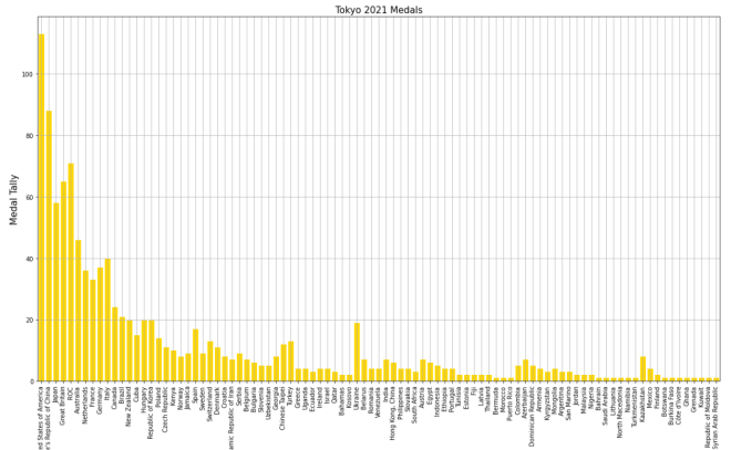
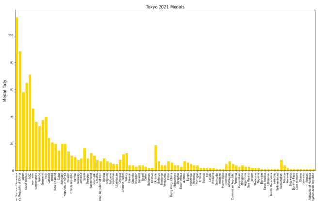
Let’s say you wanted to add some grid lines to your bar-chart. Here’s the code to do so (using the gold bar vertical bar-chart example from Python Lesson 28: Intro to MATPLOTLIB and Creating Bar-Charts (MATPLOTLIB pt. 1)):

tokyo21medals.plot(x='Country', y='Total', kind='bar', figsize=(20,11), legend=None)
plt.title('Tokyo 2021 Medals', size=15)
plt.ylabel('Medal Tally', size=15)
plt.xlabel('Country', size=15)
xValues = np.array(tokyo21medals['Country'])
yValues = np.array(tokyo21medals['Total'])
plt.bar(xValues, yValues, color = 'gold')
plt.grid()

Pretty neat, right? After all, all you needed to do was pop the plt.grid() function to your code and you get neat-looking grid lines. However, in this bar-chart, it isn’t ideal to have grid lines along both axes.

Let’s say you only wanted grid lines along the y-axis. Here’s the slight change in the code you’ll need to make:

plt.grid(axis='y')

In order to only display grid lines on one axis, pass in an axis parameter to the plt.grid() function and set the value of axis as the axis you wish to use as the parameter (either x or y). In this case, I set the value of axis to y since I want the gridlines on the y-axis.

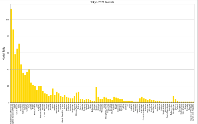
Here’s the new graph with the gridlines on just the y-axis:

Honestly, I think this looks much neater!

Now, what if you wanted to plot a bar-chart with several differently-colored bars side-by-side? In the context of this dataset, let’s say we wanted to plot each country’s bronze medal, silver medal, and gold medal count side-by-side. Here’s the code we’d need to use:

tokyo21medalssubset = tokyo21medals[0:10]

plt.figure(figsize=(20,11))
X = tokyo21medalssubset['Country']
bronze = tokyo21medalssubset['Bronze Medal']
silver = tokyo21medalssubset['Silver Medal']
gold = tokyo21medalssubset['Gold Medal']
Xaxis = np.arange(len(X))
plt.bar(Xaxis - 0.2, bronze, 0.3, label='Bronze medals', color='#cd7f32')
plt.bar(Xaxis, silver, 0.3, label='Silver medals', color='#c0c0c0')
plt.bar(Xaxis + 0.2, gold, 0.3, label='Gold medals', color='#ffd700')
plt.xticks(Xaxis, X)
plt.xlabel('Country', size=15)
plt.ylabel('Total medals won', size=15)
plt.title('Tokyo 2021 Olympic medal tallies', size=15)
plt.legend()
plt.show()

So, how does all of the code work? Well, before I actually started creating the code that would create the bar-chart, I first created a subset of the tokyo21medals data-frame aptly named tokyo21medalssubset that contains only the first 10 rows of the tokyo21medals data-frame. The reason I did this was because the bar-chart would look rather cramped if I tried to include all countries.

After creating the subset data-frame, I then ran the plt.figure function with the figsize tuple to set the size of the plot to (20,11).

The variable X grabs the x-axis values I want to use from the data-frame-in this case I’m grabbing the Country values for the x-axis. However, X doesn’t create the x-axis; that’s the work of the aptly-named Xaxis variable. Xaxis actually creates the nice, evenly-spaced intervals that you see on the above bar-chart’s x-axis; it does so by using the np.arange() function and passing in len(X) as the parameter.

As for the bronze, silver, and gold variables, they store all of the Bronze Medal, Silver Medal, and Gold Medal values from the tokyo21medalssubset data-frame.

After creating the Xaxis variable, I then ran the plt.bar() function three times-one for each column of the data-frame I used. Each plt.bar() function has five parameters-the bar’s distance from the “center bar” in inches (represented with Xaxis +/- 0.2), the variable representing the column that the bar will use (bronze, silver, or gold), the width of the bar in inches (0.3 in this case), the label you want to use for the bar (which will be used for the bar-chart’s legend), and the color you want to use for the bar (I used the hex codes for bronze, silver, and gold).

  • By “center bar”, I mean the middle bar in a group of bars on the bar-chart. In this bar-chart, the “center bar” is always the grey bar as it is always between the silver and gold bars in all of the bar groups.
  • Don’t worry, I’ll cover color hex codes in greater detail in a future post.

After creating the bronze, gold, and silver bars, I then used the plt.xticks() function-and passed in the X and Xaxis variable to create the evenly-spaced x-axis tick marks on the bar-chart. Once the x-axis tick marks are plotted, I used the plt.title(), plt.xlabel(), and plt.ylabel() functions to set the labels (and display sizes) for the chart’s title, x-axis, and y-axis, respectively.

Lastly, I ran the plt.legend() and plt.show() functions to create the chart’s legend and display the chart, respectively. Remember the label parameter that I used in each of the plt.bar() functions? Well, each of these values were used to create the bar-chart’s legend-complete with the appropriate color-coding!

Now, what if instead of plotting the bronze, silver, and gold bars side-by-side, you wanted to plot them stacked on top of each other. Here’s the code we’d use to do so:

plt.figure(figsize=(20,11))
X = tokyo21medalssubset['Country']
bronze = tokyo21medalssubset['Bronze Medal']
silver = tokyo21medalssubset['Silver Medal']
gold = tokyo21medalssubset['Gold Medal']
Xaxis = np.arange(len(X))
plt.bar(Xaxis, bronze, 0.3, label='Bronze medals', color='#cd7f32')
plt.bar(Xaxis, silver, 0.3, label='Silver medals', color='#c0c0c0', bottom=bronze)
plt.bar(Xaxis, gold, 0.3, label='Gold medals', color='#ffd700', bottom=silver)
plt.xticks(Xaxis, X)
plt.xlabel('Country', size=15) 
plt.ylabel('Total medals won', size=15)
plt.title('Tokyo 2021 Olympic medal tallies', size=15)
plt.legend()
plt.show()

Now, this code is similar to the code I used to create the bar-chart with the side-by-side bars. However, there are some differences the plt.bar() functions between these two charts, which include:

  • There’s no +/- 2 in any parameter, as I’m stacking bars on top of each other rather than plotting them side-by-side
  • For the second and third plt.bar() functions, I included a bottom parameter and set the value of this parameter to the bar I want to plot below the bar I’m plotting.
    • OK, that may sound confusing, but to clarify, when I’m plotting the silver bar, I set bottom equal to bronze as I’m plotting the bronze bar below the silver bar. Likewise, when I plot the gold bar, I set bottom equal to silver, as I want the silver bar below the gold bar.

Honestly, this looks much neater than the side-by-side bar-chart we made.

Aside from the differences in plt.bar() functions between this chart and the chart above, the rest of the code is the same between the two charts.

Thanks for reading,

Michael
Python Lesson 28: Intro to MATPLOTLIB and Creating Bar-Charts (MATPLOTLIB pt. 1)

Hello everybody,

Michael here, and today’s lesson will serve as an intro to Python’s MATPLOTLIB package-this is part 1 in my MATPLOTLIB series. I will also cover bar-chart manipulation with MATPLOTLIB.

Now, as I mentioned in my previous post (Pandas Lesson 27: Creating Pandas Visualizations (pandas pt. 4)), MATPLOTLIB is another Python visualization creation package-just like pandas-but unlike the pandas package, MATPLOTLIB has more functionalities (such as adding interactive components to visualizations).

Now, to work with the MATPLOTLIB package, be sure to run this command to install the package-pip install matplotlib (or run the pip list command to check if you already have it).

For this post, we’ll be working with the same Tokyo 2021 dataset we used for the previous post (click the Pandas Lesson 27 link to find and download that dataset).

Once you’ve installed the MATPLOTLIB package, run this code in your IDE:

import pandas as pd
import matplotlib.pyplot as plt
%matplotlib inline

tokyo21medals = pd.read_csv('C:/Users/mof39/OneDrive/Documents/Tokyo Medals 2021.csv')
  • Since I didn’t discuss the PYPLOT sub-package, I’ll do so right here. PYPLOT is essentially a MATPLOTLIB sub-package that contains the majority of MATPLOTLIB’s utilities-this is why when we import MATPLOTLIB to our IDE, we usually include the PYPLOT sub-package.

You’ll probably recognize all of this code from the previous post. That’s because I used some MATPLOTLIB in the previous post and included the %matplotlib inline line. You’ll also need to import pandas and create a pandas data-frame that stores the Tokyo Medals 2021 dataset into the IDE (just for consistency’s sake, I’ll call this data-frame tokyo21medals).

Now, before we get into more MATPLOTLIB specifics, let’s review the little bit of MATPLOTLIB I covered in the previous lesson.

So, just to recap, here’s the MATPLOTLIB code I used to create the bar-chart in the previous lesson:

tokyo21medals.plot(x='Country', y='Total', kind='bar', figsize=(20,11))
plt.title('Tokyo 2021 Medals', size=15)
plt.ylabel('Medal Tally', size=15)
plt.xlabel('Country', size=15)

And here’s the bar-chart that was generated:

Now, how exactly did I generate this bar-chart? First of all, I used pandas’ plot() function (remember to import pandas) and filled it with four parameters-the column I want to use for the x-axis, the column I want to use for the y-axis, the type of visual I want to create, and the display size I want for said visual.

After creating the blueprint of the visual with pandas’ plot() function, I then used MATPLOTLIB’s plt.title() function to set a title for the bar-chart (I also passed in a size parameter to set the display size of the title). Next, I used MATPLOTLIB’s plt.ylabel() function to set a label for the chart’s y-axis and just as I did with the plt.title() function, I passed in a size parameter to set the display size for the y-axis label. Lastly, I used the plt.xlabel() function to change the bar-chart’s x-axis label, and, just as I did for the plt.title() and plt.xlabel() functions, I also added a size parameter to set the display size for the x-axis label. However, when you first create the bar-chart, you’ll notice that a default x-axis label has already been set-Country-which is the name of the column I chose for the x-axis. In this case, I didn’t change the label name, just the label display size. However, in order to change the label display size, you’ll need to pass in the x-axis label you’d like to use as the first parameter of the plt.xlabel() axis function.

  • Why do all of these functions start with plt? Remember the import matplotlib.pyplot as plt import you did.

Now, MATPLOTLIB bars are blue by default. What if you wanted to change their color? Let’s say we wanted to go with the theme of this dataset and change all the bars to gold (this dataset covers Tokyo 2021 Olympic medal tallies, after all). Here’s the code to do so:

tokyo21medals.plot(x='Country', y='Total', kind='bar', figsize=(20,11))
plt.title('Tokyo 2021 Medals', size=15)
plt.ylabel('Medal Tally', size=15)
plt.xlabel('Country', size=15)
xValues = np.array(tokyo21medals['Country'])
yValues = np.array(tokyo21medals['Total'])
plt.bar(xValues, yValues, color = 'gold')

So, how did I get the gold color on all of these bars? Well, before I discuss that, let me remind you that you’ll need to install NumPy (import numpy as np in case you forgot) here. I’ll explain why shortly.

After you create the outline for the bar-chart (with panda’s plot() function) and set labels for the bar-chart’s x-axis, y-axis, and title, you’ll need to store the values for the x-axis and y-axis in NumPy arrays (this is where the NumPy package comes in). For both the x-axis and y-axis, use the np.array() function and pass in the data-frame columns you used for the x-axis and y-axis, respectively. After creating the NumPy arrays, write this line of code-plt.bar(xValues, yValues, color = 'gold'). The plt.bar() function takes three parameters-the two NumPy arrays you created for you x-axis and y-axis and the color parameter which sets the color of the bars (I set the bars to gold in this case).

  • Hex codes will work for the color as well.

Looks pretty good! But wait, the legend is still blue!

In this case, let’s remove the legend altogether. Here’s the code to do so:

tokyo21medals.plot(x='Country', y='Total', kind='bar', figsize=(20,11), legend=None)
plt.title('Tokyo 2021 Medals', size=15)
plt.ylabel('Medal Tally', size=15)
plt.xlabel('Country', size=15)
xValues = np.array(tokyo21medals['Country'])
yValues = np.array(tokyo21medals['Total'])
plt.bar(xValues, yValues, color = 'gold')

And here’s the bar-chart without the legend:

In order to remove the legend from the bar-chart, all you needed to do was add the line legend=None to the tokyo21medals.plot() function. The legend=None line removes the legend from the bar-chart.

Last but not least, let’s explore how to display the bars horizontally rather than vertically.

Assuming we keep the gold coloring on the bars, here’s the code you’d need to display the bars horizontally:

plt.figure(figsize=(25,25))
plt.title('Tokyo 2021 Medals', size=15)
plt.ylabel('Country', size=15)
plt.xlabel('Medal Tally', size=15)
xValues = np.array(tokyo21medals['Country'])
yValues = np.array(tokyo21medals['Total'])
plt.barh(xValues, yValues, color='gold')

And here’s the new bar-chart with the horizontal bars (well, part of it-the bar-chart was too big to fit in one picture):

As you can see, the code I used to create this horizontal bar-chart is different from the code I used to create the vertical bar-chart. Here are some of those code differences:

  • I didn’t use pandas’ plot() function at all; to create the horizontal bar-chart, PYPLOT functions alone did the trick.
  • Unlike the code I used for the vertical bar-charts, I included PYPLOT’s figsize() function as the first function to be executed in this code block. I passed in a two-element tuple as this function’s parameter in order to set the size of the bar-chart (in this case, I set the bar-chart’s size to 25×25).
    • Just a suggestion, but if you’re using MATPLOTLIB to create your visual, you should set the size of the visual in the first line of code you use to create your visual.
  • Country is in the x-axis NumPy array while Total is in the y-axis NumPy array.
  • To plot the bar chart, I used PYPLOT’s barh() function rather than the bar() function. I still passed in a color parameter to the barh() function, though.

Even with all these differences, I didn’t change the plot title, x-axis label, or y-axis label.

Thanks for reading,

Michael
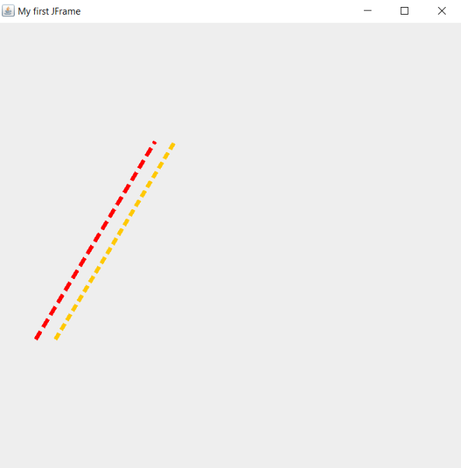
EXCITING BLOG UPDATE

Hello everybody,

So, this won’t be another post trying to teach you guys an interesting programming lesson (though I’ve got plenty more of those coming). Rather, I just want to use this post to share some an exciting blog update with you.

For the last three years, you’ve all followed me as I shared my amazing programming & data science content on this blog (and I am very very grateful for all of you who’ve read and/or shared my content during this blog’s run).

Now for the update. My blog posts will have ANOTHER home. Yes, I figured that, with three years under my belt and 107 posts under my belt, it was time to grow my little blog (and in turn, grow this little blog’s following). And so, without further ado, I’d like to announce that my future posts (starting with Python Lesson 27: Creating Pandas Visualizations (pandas pt. 4)-posted on September 22, 2021) will also be published on Medium (another great blogging platform for those unaware). Here’s the Medium link to the Python Lesson 27 post-https://medium.com/@michael71314/pandas-lesson-27-creating-pandas-visualizations-pandas-pt-4-ab3e49e838ca.

  • In case you’re wondering, this post will not be published on Medium.

Does this mean you’ll no longer find my great content on WordPress? No! This news just means that my blog will now have TWO homes. For those who love following me on WordPress, you’ll still see all my new content here too.

Now, you’re probably wondering if you’ll see my whole archive of posts on Medium. So far, I’m not planning to add the whole catalog to Medium, but I’ll let you all know if I change my mind.

Thanks again for reading and/or sharing my posts,

Michael

P.S. If you want to connect with me on Medium, look for Michael Orozco-Fletcher-the name shouldn’t be hard to miss 😉 Looking forward to growing my little blog and teaching more people around the world the joys of coding, programming, and data analytics!
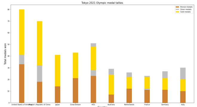
Python Lesson 27: Creating Pandas Visualizations (pandas pt. 4)

Hello everybody,

Michael here, and today’s post will be about creating visualizations in Python’s pandas package. This is the dataset we will be using:

These three datasets contains information regarding the Tokyo 2021 (yes I’ll call it that) Olympics medal tally for each participating country-this include gold medal, silver medal, bronze medal, and total medal tallies for each nation.

Once you open your IDE, run this code:

import pandas as pd

tokyo21medals = pd.read_csv('C:/Users/mof39/Downloads/Tokyo Medals 2021.csv')

Now, let’s check the head of the data-frame we’ll be using for this lesson. Here’s the head of the tokyo21medals data-frame:

As you can see, this data-frame has 5 variables, which include:

  • Country-the name of a country
  • Gold Medal-the country’s gold medal tally
  • Silver Medal-the country’s silver medal tally
  • Bronze Medal-the country’s bronze medal tally
  • Total-the country’s total medal tally

OK, now that we’ve loaded and analyzed our data-frame, let’s start building some visualizations.

Let’s create the first visualization using the tokyo21medals data-frame with this code:

tokyo21medals.plot(x='Country', y='Total')

And here’s what the plot looks like:

The plot was successfully created, however, here are some things we can fix:

  • The y-axis isn’t labelled, so we can’t tell what it represents.
  • A title for the plot would be nice as well.
  • The plot should be larger.
  • A line graph isn’t the best visual for what we’re trying to plot

So, how can we make this graph better? The first thing we’d need to do is import the MATPLOTLIB package:

import matplotlib.pyplot as plt
%matplotlib inline

What exactly does the MATPLOTLIB package do? Well, just like the pandas package, the MATPLOTLIB package allows you to create Python visualizations. However, while the pandas package allows you to create basic visualizations, the MATPLOTLIB package allows you to add interactive and animated components to the visual. MATPLOTLIB also allows you to modify certain components of the visual (such as the axis labels) that can’t be modified with pandas alone; in that sense, MATPLOTLIB works as a great supplement to pandas.

  • I’ll cover the MATPLOTLIB package more in depth in a future post, so stay tuned!

The %matplotlib inline code is really only used for Jupyter notebooks (like I’m using for this lesson); this code ensures that the visual will be displayed directly below the code as opposed to being displayed on another page/window.

Now, let’s see how we can fix the visual we created earlier:

tokyo21medals.plot(x='Country', y='Total', kind='bar', figsize=(20,11))
plt.title('Tokyo 2021 Medals', size=15)
plt.ylabel('Medal Tally', size=15)

In the plot() function, I added two parameters-kind and figsize. The kind parameter allows you to change the type of visual you want to create-the default visual that pandas uses is a line graph. By setting the value of kind equal to bar, I’m able to create a bar-chart with pandas. The figsize parameter allows you to change the size of the visual using a 2-value tuple (which can consists of integers and/or floats). The first value in the figsize tuple represents width (in inches) of the visual and the second value represents height (also in inches) of the visual. In this case, I assigned the tuple (20,11) to the `figsize parameter, which makes the visual 20 inches wide by 11 inches tall.

Next, take a look at the other lines of code in the code block (both of which begin with plt). The plt functions are MATPLOTLIB functions that allow you to easily modify certain components of your pandas visual (in this case, the y-axis and title of the visual).

In this example, the plt.title() function took in two parameters-the title of the chart and the font size I used for the title (size 15). The plt.ylabel() function also took in two parameters-the name and font size I used for the y-axis label (I also used a size 15 font here).

So, the chart looks much better now, right? Well, let’s take a look at the x-axis:

The label for the x-axis is OK, however, it’s awfully small. Let’s make the x-axis label size 15 so as to match the sizing of the title and y-axis label:
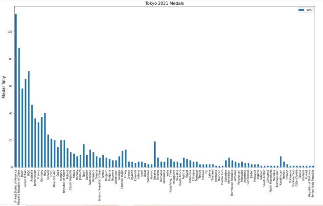
plt.xlabel('Country', size=15)

To change the size of the x-axis label, use the plt.xlabel() function and pass in two parameters-the name and size you want to use for the x-axis label. And yes, even though there is already an x-axis label, you’ll still need to specify a name for the x-axis label in the plt.xlabel() function.

  • Just a helpful tip-execute the plt.xlabel() function in the same code-block where you executed the plot() function and plt() functions.

Now, let’s see what the x-axis label looks like after executing the code I just demonstrated:

The x-axis label looks much better (and certainly more readable)!

Thanks for reading,

Michael