Hello everybody,
Michael here, and today’s lesson will serve as an intro to Python’s MATPLOTLIB package-this is part 1 in my MATPLOTLIB series. I will also cover bar-chart manipulation with MATPLOTLIB.
Now, as I mentioned in my previous post (Pandas Lesson 27: Creating Pandas Visualizations (pandas pt. 4)), MATPLOTLIB is another Python visualization creation package-just like pandas-but unlike the pandas package, MATPLOTLIB has more functionalities (such as adding interactive components to visualizations).
Now, to work with the MATPLOTLIB package, be sure to run this command to install the package-pip install matplotlib (or run the pip list command to check if you already have it).
For this post, we’ll be working with the same Tokyo 2021 dataset we used for the previous post (click the Pandas Lesson 27 link to find and download that dataset).
Once you’ve installed the MATPLOTLIB package, run this code in your IDE:
import pandas as pd
import matplotlib.pyplot as plt
%matplotlib inline

tokyo21medals = pd.read_csv('C:/Users/mof39/OneDrive/Documents/Tokyo Medals 2021.csv')- Since I didn’t discuss the PYPLOT sub-package, I’ll do so right here. PYPLOT is essentially a MATPLOTLIB sub-package that contains the majority of MATPLOTLIB’s utilities-this is why when we import MATPLOTLIB to our IDE, we usually include the PYPLOT sub-package.
You’ll probably recognize all of this code from the previous post. That’s because I used some MATPLOTLIB in the previous post and included the %matplotlib inline line. You’ll also need to import pandas and create a pandas data-frame that stores the Tokyo Medals 2021 dataset into the IDE (just for consistency’s sake, I’ll call this data-frame tokyo21medals).
Now, before we get into more MATPLOTLIB specifics, let’s review the little bit of MATPLOTLIB I covered in the previous lesson.
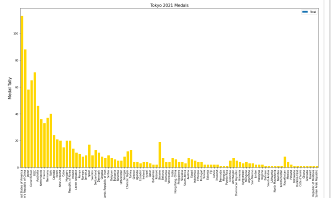
So, just to recap, here’s the MATPLOTLIB code I used to create the bar-chart in the previous lesson:
tokyo21medals.plot(x='Country', y='Total', kind='bar', figsize=(20,11))
plt.title('Tokyo 2021 Medals', size=15)
plt.ylabel('Medal Tally', size=15)
plt.xlabel('Country', size=15)
And here’s the bar-chart that was generated:


Now, how exactly did I generate this bar-chart? First of all, I used pandas’ plot() function (remember to import pandas) and filled it with four parameters-the column I want to use for the x-axis, the column I want to use for the y-axis, the type of visual I want to create, and the display size I want for said visual.
After creating the blueprint of the visual with pandas’ plot() function, I then used MATPLOTLIB’s plt.title() function to set a title for the bar-chart (I also passed in a size parameter to set the display size of the title). Next, I used MATPLOTLIB’s plt.ylabel() function to set a label for the chart’s y-axis and just as I did with the plt.title() function, I passed in a size parameter to set the display size for the y-axis label. Lastly, I used the plt.xlabel() function to change the bar-chart’s x-axis label, and, just as I did for the plt.title() and plt.xlabel() functions, I also added a size parameter to set the display size for the x-axis label. However, when you first create the bar-chart, you’ll notice that a default x-axis label has already been set-Country-which is the name of the column I chose for the x-axis. In this case, I didn’t change the label name, just the label display size. However, in order to change the label display size, you’ll need to pass in the x-axis label you’d like to use as the first parameter of the plt.xlabel() axis function.
- Why do all of these functions start with
plt? Remember theimport matplotlib.pyplot as pltimport you did.
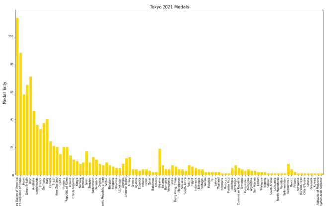
Now, MATPLOTLIB bars are blue by default. What if you wanted to change their color? Let’s say we wanted to go with the theme of this dataset and change all the bars to gold (this dataset covers Tokyo 2021 Olympic medal tallies, after all). Here’s the code to do so:
tokyo21medals.plot(x='Country', y='Total', kind='bar', figsize=(20,11))
plt.title('Tokyo 2021 Medals', size=15)
plt.ylabel('Medal Tally', size=15)
plt.xlabel('Country', size=15)
xValues = np.array(tokyo21medals['Country'])
yValues = np.array(tokyo21medals['Total'])
plt.bar(xValues, yValues, color = 'gold')
So, how did I get the gold color on all of these bars? Well, before I discuss that, let me remind you that you’ll need to install NumPy (import numpy as np in case you forgot) here. I’ll explain why shortly.
After you create the outline for the bar-chart (with panda’s plot() function) and set labels for the bar-chart’s x-axis, y-axis, and title, you’ll need to store the values for the x-axis and y-axis in NumPy arrays (this is where the NumPy package comes in). For both the x-axis and y-axis, use the np.array() function and pass in the data-frame columns you used for the x-axis and y-axis, respectively. After creating the NumPy arrays, write this line of code-plt.bar(xValues, yValues, color = 'gold'). The plt.bar() function takes three parameters-the two NumPy arrays you created for you x-axis and y-axis and the color parameter which sets the color of the bars (I set the bars to gold in this case).
- Hex codes will work for the color as well.
Looks pretty good! But wait, the legend is still blue!
In this case, let’s remove the legend altogether. Here’s the code to do so:
tokyo21medals.plot(x='Country', y='Total', kind='bar', figsize=(20,11), legend=None)
plt.title('Tokyo 2021 Medals', size=15)
plt.ylabel('Medal Tally', size=15)
plt.xlabel('Country', size=15)
xValues = np.array(tokyo21medals['Country'])
yValues = np.array(tokyo21medals['Total'])
plt.bar(xValues, yValues, color = 'gold')
And here’s the bar-chart without the legend:

In order to remove the legend from the bar-chart, all you needed to do was add the line legend=None to the tokyo21medals.plot() function. The legend=None line removes the legend from the bar-chart.
- Note: removing the legend from a visual isn’t always a good idea. I just thought it would work here since it felt unnecessary as I discussed the dataset in the previous post (Pandas Lesson 27: Creating Pandas Visualizations (pandas pt. 4) if you’d like to view it).
Last but not least, let’s explore how to display the bars horizontally rather than vertically.
Assuming we keep the gold coloring on the bars, here’s the code you’d need to display the bars horizontally:
plt.figure(figsize=(25,25))
plt.title('Tokyo 2021 Medals', size=15)
plt.ylabel('Country', size=15)
plt.xlabel('Medal Tally', size=15)
xValues = np.array(tokyo21medals['Country'])
yValues = np.array(tokyo21medals['Total'])
plt.barh(xValues, yValues, color='gold')
And here’s the new bar-chart with the horizontal bars (well, part of it-the bar-chart was too big to fit in one picture):

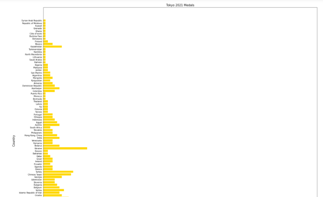
As you can see, the code I used to create this horizontal bar-chart is different from the code I used to create the vertical bar-chart. Here are some of those code differences:
- I didn’t use pandas’
plot()function at all; to create the horizontal bar-chart, PYPLOT functions alone did the trick. - Unlike the code I used for the vertical bar-charts, I included PYPLOT’s
figsize()function as the first function to be executed in this code block. I passed in a two-element tuple as this function’s parameter in order to set the size of the bar-chart (in this case, I set the bar-chart’s size to 25×25).- Just a suggestion, but if you’re using MATPLOTLIB to create your visual, you should set the size of the visual in the first line of code you use to create your visual.
Countryis in the x-axis NumPy array whileTotalis in the y-axis NumPy array.- To plot the bar chart, I used PYPLOT’s
barh()function rather than thebar()function. I still passed in acolorparameter to thebarh()function, though.
Even with all these differences, I didn’t change the plot title, x-axis label, or y-axis label.
Thanks for reading,
Michael