Hello everybody,
Michael here, and today’s lesson will cover more neat things you can do with MATPLOTLIB bar-charts.
In the previous post, I introduced you all to Python’s MATPLOTLIB package and showed you how you can use this package to create good-looking bar-charts. Now, we’re going to explore more MATPLOTLIB bar-chart functionalities.
Before we begin, remember to run these imports:
import pandas as pd
import numpy as np
import matplotlib.pyplot as plt

#Also include the %matplotlib inline line in your notebook.
Also remember to run this code:
tokyo21medals = pd.read_csv('C:/Users/mof39/OneDrive/Documents/Tokyo Medals 2021.csv')This code creates a data-frame that stores the Tokyo 2021 medals data. The link to this dataset can be found in the Python Lesson 27: Creating Pandas Visualizations (pandas pt. 4) post.
Now that we’ve done all the necessary imports, let’s start exploring more cool things you can do with a MATPLOTLIB bar-chart.
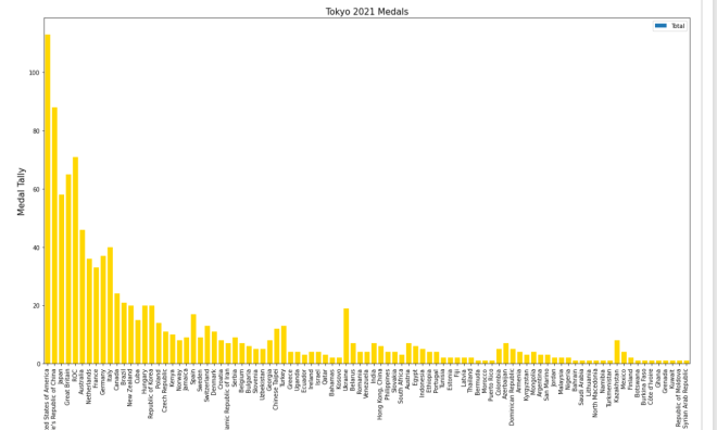
Let’s say you wanted to add some grid lines to your bar-chart. Here’s the code to do so (using the gold bar vertical bar-chart example from Python Lesson 28: Intro to MATPLOTLIB and Creating Bar-Charts (MATPLOTLIB pt. 1)):
tokyo21medals.plot(x='Country', y='Total', kind='bar', figsize=(20,11), legend=None)
plt.title('Tokyo 2021 Medals', size=15)
plt.ylabel('Medal Tally', size=15)
plt.xlabel('Country', size=15)
xValues = np.array(tokyo21medals['Country'])
yValues = np.array(tokyo21medals['Total'])
plt.bar(xValues, yValues, color = 'gold')
plt.grid()
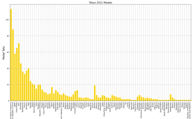
Pretty neat, right? After all, all you needed to do was pop the plt.grid() function to your code and you get neat-looking grid lines. However, in this bar-chart, it isn’t ideal to have grid lines along both axes.
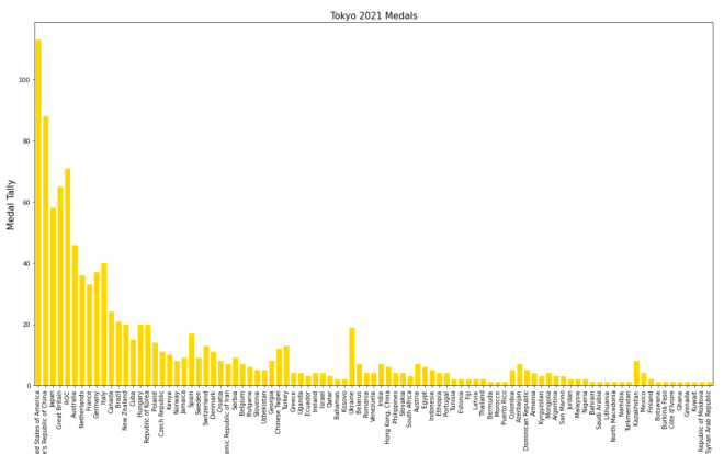
Let’s say you only wanted grid lines along the y-axis. Here’s the slight change in the code you’ll need to make:
plt.grid(axis='y')In order to only display grid lines on one axis, pass in an axis parameter to the plt.grid() function and set the value of axis as the axis you wish to use as the parameter (either x or y). In this case, I set the value of axis to y since I want the gridlines on the y-axis.
Here’s the new graph with the gridlines on just the y-axis:

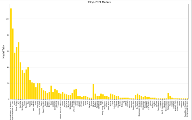
Honestly, I think this looks much neater!
Now, what if you wanted to plot a bar-chart with several differently-colored bars side-by-side? In the context of this dataset, let’s say we wanted to plot each country’s bronze medal, silver medal, and gold medal count side-by-side. Here’s the code we’d need to use:
tokyo21medalssubset = tokyo21medals[0:10]

plt.figure(figsize=(20,11))
X = tokyo21medalssubset['Country']
bronze = tokyo21medalssubset['Bronze Medal']
silver = tokyo21medalssubset['Silver Medal']
gold = tokyo21medalssubset['Gold Medal']
Xaxis = np.arange(len(X))
plt.bar(Xaxis - 0.2, bronze, 0.3, label='Bronze medals', color='#cd7f32')
plt.bar(Xaxis, silver, 0.3, label='Silver medals', color='#c0c0c0')
plt.bar(Xaxis + 0.2, gold, 0.3, label='Gold medals', color='#ffd700')
plt.xticks(Xaxis, X)
plt.xlabel('Country', size=15)
plt.ylabel('Total medals won', size=15)
plt.title('Tokyo 2021 Olympic medal tallies', size=15)
plt.legend()
plt.show()

So, how does all of the code work? Well, before I actually started creating the code that would create the bar-chart, I first created a subset of the tokyo21medals data-frame aptly named tokyo21medalssubset that contains only the first 10 rows of the tokyo21medals data-frame. The reason I did this was because the bar-chart would look rather cramped if I tried to include all countries.
After creating the subset data-frame, I then ran the plt.figure function with the figsize tuple to set the size of the plot to (20,11).
The variable X grabs the x-axis values I want to use from the data-frame-in this case I’m grabbing the Country values for the x-axis. However, X doesn’t create the x-axis; that’s the work of the aptly-named Xaxis variable. Xaxis actually creates the nice, evenly-spaced intervals that you see on the above bar-chart’s x-axis; it does so by using the np.arange() function and passing in len(X) as the parameter.
As for the bronze, silver, and gold variables, they store all of the Bronze Medal, Silver Medal, and Gold Medal values from the tokyo21medalssubset data-frame.
After creating the Xaxis variable, I then ran the plt.bar() function three times-one for each column of the data-frame I used. Each plt.bar() function has five parameters-the bar’s distance from the “center bar” in inches (represented with Xaxis +/- 0.2), the variable representing the column that the bar will use (bronze, silver, or gold), the width of the bar in inches (0.3 in this case), the label you want to use for the bar (which will be used for the bar-chart’s legend), and the color you want to use for the bar (I used the hex codes for bronze, silver, and gold).
- By “center bar”, I mean the middle bar in a group of bars on the bar-chart. In this bar-chart, the “center bar” is always the grey bar as it is always between the silver and gold bars in all of the bar groups.
- Don’t worry, I’ll cover color hex codes in greater detail in a future post.
After creating the bronze, gold, and silver bars, I then used the plt.xticks() function-and passed in the X and Xaxis variable to create the evenly-spaced x-axis tick marks on the bar-chart. Once the x-axis tick marks are plotted, I used the plt.title(), plt.xlabel(), and plt.ylabel() functions to set the labels (and display sizes) for the chart’s title, x-axis, and y-axis, respectively.
Lastly, I ran the plt.legend() and plt.show() functions to create the chart’s legend and display the chart, respectively. Remember the label parameter that I used in each of the plt.bar() functions? Well, each of these values were used to create the bar-chart’s legend-complete with the appropriate color-coding!
Now, what if instead of plotting the bronze, silver, and gold bars side-by-side, you wanted to plot them stacked on top of each other. Here’s the code we’d use to do so:
plt.figure(figsize=(20,11))
X = tokyo21medalssubset['Country']
bronze = tokyo21medalssubset['Bronze Medal']
silver = tokyo21medalssubset['Silver Medal']
gold = tokyo21medalssubset['Gold Medal']
Xaxis = np.arange(len(X))
plt.bar(Xaxis, bronze, 0.3, label='Bronze medals', color='#cd7f32')
plt.bar(Xaxis, silver, 0.3, label='Silver medals', color='#c0c0c0', bottom=bronze)
plt.bar(Xaxis, gold, 0.3, label='Gold medals', color='#ffd700', bottom=silver)
plt.xticks(Xaxis, X)
plt.xlabel('Country', size=15)
plt.ylabel('Total medals won', size=15)
plt.title('Tokyo 2021 Olympic medal tallies', size=15)
plt.legend()
plt.show()
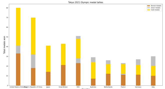
Now, this code is similar to the code I used to create the bar-chart with the side-by-side bars. However, there are some differences the plt.bar() functions between these two charts, which include:
- There’s no
+/- 2in any parameter, as I’m stacking bars on top of each other rather than plotting them side-by-side - For the second and third
plt.bar()functions, I included abottomparameter and set the value of this parameter to the bar I want to plot below the bar I’m plotting.- OK, that may sound confusing, but to clarify, when I’m plotting the
silverbar, I setbottomequal tobronzeas I’m plotting thebronzebar below thesilverbar. Likewise, when I plot thegoldbar, I setbottomequal tosilver, as I want thesilverbar below thegoldbar.
- OK, that may sound confusing, but to clarify, when I’m plotting the
Honestly, this looks much neater than the side-by-side bar-chart we made.
Aside from the differences in plt.bar() functions between this chart and the chart above, the rest of the code is the same between the two charts.
Thanks for reading,
Michael