Hello everybody,
Michael here, and first of all, Happy New Year! I bet you’re glad that 2020 is finally behind us!
Now, for my first post of 2021, I will continue my lesson on US Mapmaking with R that I started before the holidays. This time, I will cover how to fill in the map based on certain geographic data. Also, before you start coding along, make sure to install the usmap package.
Now, let’s upload our first data set (I’ll use two data sets for this lesson) to R. Here’s the file for the data:

This is a simple dataset showing the amount of COVID-19 cases and deaths in each state (excluding DC) as of January 13, 2021. However, this data-frame needs one more column-FIPS (representing the FIPS code of each state). Here’s how to add the FIPS column to this data-frame:
> file$fips <- fips(file$ï..state)
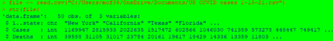
> str(file)
'data.frame': 50 obs. of 4 variables:
$ ï..state: chr "Alabama" "Alaska" "Arizona" "Arkansas" ...
$ Cases : int 410995 50816 641729 262020 2815933 366774 220576 67173 1517472 749417 ...
$ Deaths : int 5760 225 10673 4186 31105 5326 6536 994 23754 11803 ...
$ fips : chr "01" "02" "04" "05" ...In this example, I used the fips function to retrieve all of the FIPS codes for each state. I then stored the results of this function in a variable called file$fips, which attaches the fips variable to the existing file data-frame. Once I ran the str(file) command again, I see that the fips variable has been added to the file data-frame.
Now, let’s plot a basic US map with the COVID case data-this time, let’s focus on cases:
plot_usmap(data=file, values="Cases")

In order to create a US map plot of COVID cases, all I needed to do was to indicate the data (which is the data-frame file) and the values (Cases enclosed in double quotes).
As you can see, the map plot above is colored in varying shades of blue to represent a state’s cumulative COVID case count-the lighter the blue, the more cumulative cases a state had. California is the colored with lightest shade of blue, as they had over 2 million cumulative cases as of January 13, 2021. On the other hand, Vermont is colored with the darkest shade of blue, as they were the only state with fewer than 10,000 COVID cases as of January 13, 2021.
The map plot above looks good, but what if you wanted to change the color or scale? Here’s how to do so (and add a title in the process)-also keep in mind that if you want to update the color, scale, and title for the map plot, remember to install the ggplot2 package:
plot_usmap(data=file, values="Cases") + labs(title="US COVID cases in each state 1-13-21") + scale_fill_continuous(low = "lightgreen", high = "darkgreen", name = "US COVID cases", label = scales::comma) + theme(legend.position = "right")

In this example, I still created a US plot map from the Cases column in the dataset, but I changed the color scale-and in turn color-of the map plot to shades of green (where the greater of COVID cases in a state, the darker the shade of green that state is colored). I also changed the scale name to US COVID cases and labels to scales::comma, which displays the numbers on the scale as regular numbers with thousands separators (not the scientific notation that was displayed on the previous example’s scale.
After modifying the coloring and scale of the map plot, I also added a title with the labs function and used the theme function to place the legend to the right of the map plot.
Now I will create another map, this time using the Deaths column as the values. Here’s the code to do so:
plot_usmap(data=file, values="Deaths") + labs(title="US COVID deaths in each state 1-13-21") + scale_fill_continuous(low = "yellow1", high = "yellow4", name = "US COVID deaths", label = scales::comma) + theme(legend.position = "right")

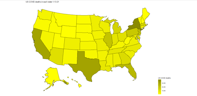
In this example, I used the same code from the previous example, except I replaced “cases” with “deaths” and colored the map in yellow-scale (the more deaths a state had, the darker the shade of yellow). As you can see, California, Texas, and New York have the darkest shades of yellow, which meant that they led the nation in COVID-19 deaths on January 13, 2021. However, unlike with COVID cases, New York led the nation in COVID deaths, not California (New York had just under 40,000 COVID deaths while California had roughly 31,000).
Now, let’s try creating a state map (broken down by county) with COVID data. For these next examples, I’ll create a county map of the state of Tennessee’s COVID cases and deaths-similar to what I did in the previous two examples.
First, let’s upload the new dataset to R. Here’s the file for the dataset:

Just like the previous dataset, this dataset also has data regarding COVID cases & deaths, except this time it’s broken down by counties in the state of Tennessee (and the data is from January 22, 2021, not January 13).
Now, before we start creating the map plots, we need to retrieve the county FIPS codes for each of the 95 Tennessee counties. Here’s the code to do so:
> file2$fips <- fips(file2$ï..county, state="TN")
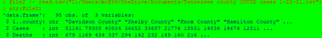
> str(file2)
'data.frame': 95 obs. of 4 variables:
$ ï..county: chr "Davidson County" "Shelby County" "Knox County" "Hamilton County" ...
$ Cases : int 81141 79388 40804 36652 33687 21776 18551 14836 14674 12811 ...
$ Deaths : int 679 1169 434 337 294 142 232 149 160 216 ...
$ fips : chr "47037" "47157" "47093" "47065" ...To retrieve the FIPS codes for counties, you would follow the same syntax as you would if you were retrieving FIPS codes for states. However, you also need to specify the state where the counties in the dataset are located-recall that from the previous lesson R Lesson 22: US Mapmaking with R (pt. 1) that there are several counties in different states that have the same name (for instance, 12 states have a Polk County, including Tennessee).
Now that we have the county FIPS codes, let’s start plotting some maps! Here’s the code to plot the map of Tennessee counties with COVID case data by county:
plot_usmap(regions="counties", data=file2, values="Cases", labels=TRUE, include=c("TN")) + labs(title="Tennessee county COVID cases 1-22-21") + scale_fill_continuous(low = "orange1", high = "orange4", name = "Tennessee county COVID cases", label = scales::comma) + theme(legend.position = "right")
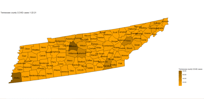
Now, the code to create a state map plot broken down by county is nearly identical to the code used to create a map plot of the whole US with a few differences. Since you are plotting a map of an individual state, you need to specify the state you are plotting in the include parameter’s vector (the state is TN in this case). Also, since you are breaking down the state map by county, specify that regions are counties (don’t use county since you’re plotting all counties in a specific state, not just a single county).
- You don’t need to add the county name labels to the map-I just thought that it would be a nice addition to the map plot.
In this example, I colored the map plot in orange-scale (meaning that the more cases of COVID in a county, the darker the shade of orange will be used). As you can see, the four counties with the darkest shades of orange are Davidson, Shelby, Knox, and Hamilton counties, meaning that these four counties had the highest cumulative case count as of January 22, 2021. These four counties also happen to be where Tennessee’s four major cities-Nashville, Memphis, Knoxville, and Chattanooga-are located.
Now let’s re-create the plot above, except this time let’s use the Deaths variable for values (and change the color-scale as well):
plot_usmap(regions="counties", data=file2, values="Deaths", labels=TRUE, include=c("TN")) + labs(title="Tennessee county COVID deaths 1-22-21") + scale_fill_continuous(low = "turquoise1", high = "turquoise4", name = "Tennessee county COVID deaths", label = scales::comma) + theme(legend.position = "right")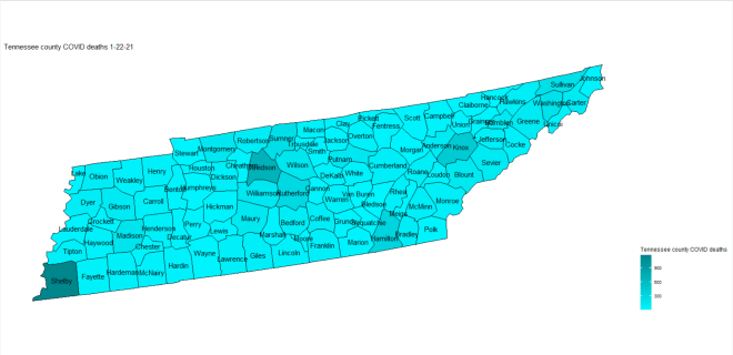
In this example, I used the same code from the previous example, except I used Deaths for the values and replaced the word “cases” with “deaths” on both the legend scale and title of the map plot. I also used turquoise-scale for this map plot rather than orange-scale.
An interesting difference between this map plot and the Tennessee COVID cases map plot is that, while the four counties that led in case counts (Hamilton, Knox, Shelby, and Davidson) also led in deaths, Shelby County is actually darker on the map than Davidson county, which implies that Shelby County (where Memphis is located) led in COVID deaths (Davidson County led in cases).
Thanks for reading, and can’t wait to share more great programming and data analytics content in 2021 with you all!
Michael


